CSSデザイン画像エフェクト
- CSS Gradient Text Effect〔テキストにグラデーションをかける〕
- 5 Ways to Spice up Your Images with CSS〔画像にCSSで様々なエフェクトを付ける〕
- CSS Decorative Gallery〔CSSで飾りつけをした画像ギャラリー〕
- Fade Out Bottom〔スクロールしても常にページの下部にフェードアウト効果を付ける〕
- 画像に影をつける
CSS Gradient Text Effect
テキストにグラデーションをかける
unknown
CSS Gradient Text Effect
グラーデーションのかかった透過PNG画像をテキストにCSSで重ねて、テキストにグラーデーション効果を付ける方法が掲載されています。 親要素内にspan要素とテキストを指定し、span要素の背景画像としてグラーデーションのかかった透過PNGを指定しています。 IE6は透過PNG未対応のため、IE6対応する場合は、下記のコードをspan要素に指定する必要があります。
background: none;
filter:progid:DXImageTransform.Microsoft.AlphaImageLoader(src='背景画像URL', sizingMethod='scale');
jQueryを使用して、動的に親要素内にspan要素を追加するサンプルも掲載されています。
例:白背景
<!-- HTML -->
<div class='cgte gradient-glossy'><span></span>Gradient Glossy</div>
<div class='cgte gradient-white'><span></span>Gradient White</div>
<div class='cgte gradient-grey'><span></span>Gradient Gray</div>

<!-- CSS -->
<style type='text/css'>
div.cgte {
    font-family:verdana,sans-serif;
    line-height:1;
    font-weight:bold;
    font-size:30px;
    position:relative;
    color:#464646;
    padding:15px 0;
}
div.cgte span {
    position:absolute;
    display:block;
    width:100%;
}
/* Gradient Glossy */
div.gradient-glossy span {
    height:30px;
    background:transparent url(/content/img/css/css_gradient/gradient-glossy.png) repeat-x 0 0;
}
* html div.gradient-glossy span {
    background: none;
      filter: progid:DXImageTransform.Microsoft.AlphaImageLoader(src='/content/img/css/css_gradient/gradient-glossy.png', sizingMethod='scale');
}
/* Gradien White */
div.gradient-white span {
    height:30px;
    background:transparent url(/content/img/css/css_gradient/gradient-white.png) repeat-x 0 0;
}
* html div.gradient-white span {
    background: none;
      filter: progid:DXImageTransform.Microsoft.AlphaImageLoader(src='/content/img/css/css_gradient/gradient-white.png', sizingMethod='scale');
}
/* Gradient Gray */
div.gradient-grey span {
    height:30px;
    background:transparent url(/content/img/css/css_gradient/gradient-grey.png) repeat-x 0 0;
}
* html div.gradient-grey span {
    background: none;
      filter: progid:DXImageTransform.Microsoft.AlphaImageLoader(src='/content/img/css/css_gradient/gradient-grey.png', sizingMethod='scale');
}
</style>
例:黒背景
<!-- HTML -->
<div style='background-color:#000;color:#fff; padding:10px;'>
    <div class='cgte_b gradient-dark'><span></span>Gradient Gray</div>
    <div class='cgte_b gradient-shine'><span></span>Gradient Shine</div>
    <div class='cgte_b gradient-dark-stripe'><span></span>Vertical Stripe</div>
    <div class='cgte_b gradient-dark-stripe-hz'><span></span>Horizontal Stripe</div>
    <div class='cgte_b pattern'><span></span>Pattern Zebra</div>
</div>

<!-- CSS -->
<style type='text/css'>
div.cgte_b {
    padding:15px 0;
    font-weight:bold;
    font-size:40px;
    position:relative;
    color: #b7b7b7;
    overflow:hidden;
    line-height:1;
}
div.cgte_b span {
    position: absolute;
    display: block;
    width: 100%;
    height:40px;
}
div.gradient-dark span {
    height:40px;
    bottom: -0.1em;
    background:transparent url(/content/img/css/css_gradient/gradient-dark.png) repeat-x 0 0;
}
* html div.gradient-dark span {
    background: none;
      filter: progid:DXImageTransform.Microsoft.AlphaImageLoader(src='/content/img/css/css_gradient/gradient-dark.png', sizingMethod='scale');
}
div.gradient-shine {
    color: #fff;
}
div.gradient-shine span {
    height:80px;
    background:transparent url(/content/img/css/css_gradient/gradient-shine.png) repeat-x 0 0;
}
* html div.gradient-shine span {
    background: none;
      filter: progid:DXImageTransform.Microsoft.AlphaImageLoader(src='content/img/css/css_gradient/gradient-shine.png', sizingMethod='scale');
}
div.gradient-dark-stripe span {
    background:transparent url(/content/img/css/css_gradient/gradient-dark-stripe.png) repeat-x 0 0;
    bottom: -0.1em;
}
* html div.gradient-dark-stripe span {
    background: none;
      filter: progid:DXImageTransform.Microsoft.AlphaImageLoader(src='content/img/css/css_gradient/gradient-dark-stripe.png', sizingMethod='scale');
}
div.gradient-dark-stripe-hz span {
    background:transparent url(/content/img/css/css_gradient/gradient-dark-stripe-hz.png) repeat-x 0 0;
    bottom: -0.1em;
}
* html div.gradient-dark-stripe-hz span {
    background: none;
      filter: progid:DXImageTransform.Microsoft.AlphaImageLoader(src='content/img/css/css_gradient/gradient-dark-stripe-hz.png', sizingMethod='scale');
}
div.pattern span {
    background:transparent url(/content/img/css/css_gradient/pattern-zebra.png) repeat-x 0 0;
}
* html div.pattern span {
    background: none;
      filter: progid:DXImageTransform.Microsoft.AlphaImageLoader(src='content/img/css/css_gradient/pattern-zebra.png', sizingMethod='scale');
}
</style>
5 Ways to Spice up Your Images with CSS
画像にCSSで様々なエフェクトを付ける
2008/12/6
5 Ways to Spice up Your Images with CSS
画像にCSSを使用してエフェクトを付ける方法が5つ紹介されています。
例1:画像に影を付ける
下と左に影を付けた影画像(1000px×1000px)をimg要素の背景に指定し、内余白(padding)を調整して影を落としたような効果を与えています。
<style type='text/css'>
img.shadow {
  background:transparent url(/content/img/css/shadow-1000x1000.gif) no-repeat right bottom;
  padding:5px 10px 10px 5px;
}
</style>
<img class='shadow' src='画像URL' alt='' />
例2:画像を2重線で囲ったようなエフェクトを付ける
外側の枠線はimg要素のborderプロパティで指定し、内側の枠線はimg要素の内余白(padding)と背景色で指定します。
<style type='text/css'>
img.double-border {
  border:5px solid #ddd; /* 外側のボーダー */
  padding:5px; /* 内側のボーダの太さ */
  background:#fff; /* 内側のボーダー色 */
}
</style>
<img class='double-border' src='画像URL' alt='' />
例3:画像に額縁のような枠線を付ける
画像の上に、画像と同じサイズの枠線付きの透過PNGをCSSで重ねて表示しています。IE6は透過PNG未対応なので、filterを使うなどの対策が必要です。
<style type='text/css'>
.frame-block {
  width:240px; height:180px; /* 画像の幅・高さと同じ */
  position:relative;
  display:block;
}
.frame-block span {
  background:transparent url(背景画像URL) no-repeat center top;
  width:240px; height:180px; /* 画像の幅・高さと同じ */
  display:block;
  position:absolute;
  /* for IE6 */
  background:none;
  filter: progid:DXImageTransform.Microsoft.AlphaImageLoader(src='/content/img/css/spup_frame.png', sizingMethod='scale');
}
</style>
<div class='frame-block'>
  <span> </span>
  <img src='画像URL' alt='' />
</div>
例4:画像にウォーターマークを付ける
ウォーターマーク画像の上に画像を重ね、画像の方を透過させることで、背景画像が透けて見えるようになっています。
<style type='text/css'>
.transp-block {
  background:#000 url(ウォーターマーク画像URL) no-repeat 0 0;
  width:240px; height:180px; /* 画像の幅・高さ */
  overflow:hidden;
}
.spup_transp-block img.transparent {
  filter:alpha(opacity=75);
  opacity:.75;
}
</style>
<div class='transp-block'>
  <img class='transparent' src='画像URL' alt='' />
</div>
例5:画像に半透明のタイトル帯を付ける
画像の上に、画像のタイトルを指定したcite要素を重ね、cite要素をCSSで透過させています。
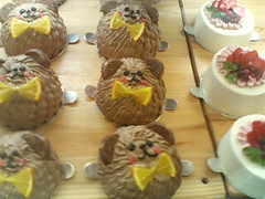
くまさんケーキ (^・ω・^)
<div class='img-desc'>
  <img src='画像URL' alt='' />
  <cite>画像のタイトル</cite>
</div>
<style type='text/css'>
.img-desc {
  position:relative;
  display:block;
  width:240px; height:180px;
  overflow:hidden;
  text-align:center;
}
.img-desc cite {
  margin:0; padding:10px;
  background:#111;
  filter:alpha(opacity=55);
  opacity:.55;
  color:#fff;
  position:absolute;
  bottom:0; left:0;
  width:220px;
  border-top:1px solid #999;
}
</style>
CSS Decorative Gallery
CSSで飾りつけをした画像ギャラリー
2008/12/6
CSS Decorative Gallery
CSSで画像に装飾をして画像ギャラリーを作るテクニックがたくさん掲載されています。 コルクボードに写真を貼っているように見せたり、テープで画像を貼り付けているように見せたり、つやつやに見せたり・・・など、発想しだいでCSSでこんなユニークなことが出来るんだと勉強になります。 iepngfix.htcを使用して、IE6での透過PNG表示にも対応しています。 jQueryやflashでテキストを表示するサンプルもありますが、下記ではCSSのみで実装できるサンプルをまとめてみました。
 設置イメージ
<!DOCTYPE html PUBLIC "-//W3C//DTD XHTML 1.0 Transitional//EN" "http://www.w3.org/TR/xhtml1/DTD/xhtml1-transitional.dtd">
<html xmlns="http://www.w3.org/1999/xhtml" xml:lang="ja" lang="ja">
<head>
<meta http-equiv="Content-Type" content="text/html; charset=utf-8" />
<meta http-equiv="Content-Language" content="ja" />
<meta http-equiv="Content-Script-Type" content="text/javascript" />
<meta http-equiv="Content-Style-Type" content="text/css" />
<meta http-equiv="imagetoolbar" content="no" />
<title>CSS Decorative Gallery | 設置サンプル</title>
<link rel="stylesheet" type="text/css" href="/content/lib/global.css" />
<style type="text/css">
/* ---------- gallery styles start here ----------------------- */
.gallery {
list-style:none;
margin:0;
padding:0;
}
.gallery a {
text-decoration:none;
}
.gallery li {
margin:10px;
padding:0;
float:left;
position:relative;
width:240px;
height:180px;
}
/* 例1:Simple Gallery */
.gallery li.tape img {
background:#fff;
border:solid 1px #ccc;
padding:4px;
}
.gallery li.tape span {
width:77px;
height:27px;
display:block;
position:absolute;
top:-12px;
left:80px;
background:url(/content/img/css/decorative-gallery/tape.png) no-repeat;
}
/* 例2:Mini Icons */
.gallery li.mini-icons {
margin:10px;
padding:0;
float:left;
position:relative;
width:240px;
height:180px;
}
.gallery li.mini-icons img {
background:#fff;
border:solid 1px #ccc;
padding:4px;
}
.gallery li.mini-icons span {
width:20px;
height:18px;
display:block;
position:absolute;
bottom:10px;
right:10px;
}
.gallery li.mini-icons .favorite {
background:url(/content/img/css/decorative-gallery/favorite.gif) no-repeat;
}
.gallery li.mini-icons .photo {
background:url(/content/img/css/decorative-gallery/photo.gif) no-repeat;
}
.gallery li.mini-icons .video {
background:url(/content/img/css/decorative-gallery/video.gif) no-repeat;
}
.gallery li.mini-icons a:hover img {
border-color:#666;
}
.gallery li.mini-icons a:hover span {
background-position:left -22px;
}
/* 例3:Photo with CSS */
.gallery li.photo-with-text:hover img {
border-color:#000;
}
.gallery li.photo-with-text img {
background:#fff;
border:solid 1px #888;
padding:5px;
}
.gallery li.photo-with-text em {
background:#fff url(/content/img/css/decorative-gallery/grey-gradient.gif) repeat-y;
color:#000;
font-style:normal;
padding:2px 10px;
display:block;
position:absolute;
top:160px;
left:9px;
border:1px solid #999;
border-left-color:#888;
}
.gallery li.photo-with-text a:hover em {
background:#ffdb01 url(/content/img/css/decorative-gallery/orange-gradient.gif) repeat-y;
border-color:#c25b08;
}
/* 例4:Popup Text */
.gallery li.popup-text img {
background:#fff;
border:solid 1px #ccc;
padding:5px;
}
.gallery li.popup-text:hover img {
border-color:#999;
}
.gallery li.popup-text em {
width:102px;
background:url(/content/img/css/decorative-gallery/bubble.gif) no-repeat;
padding:3px 0 6px;
display:none;
position:absolute;
top:-2px;
left:80px;
line-height:1;
font-style:normal;
text-align:center;
}
..gallery li.popup-text a {
text-decoration:none;
color:#000;
}
.gallery li.popup-text a:hover em {
display:block;
}
/* 例5:Mini Paper Clip */
.gallery li.mini-paper-clip:hover img {
border-color:#000;
}
.gallery li.mini-paper-clip img {
background:#fff;
border:solid 1px #ccc;
padding:5px;
}
.gallery li.mini-paper-clip em {
background:#fff;
color:#000;
font-style:normal;
padding:2px 8px 0 22px;
display:block;
position:absolute;
top:20px;
left:5px;
border:1px solid #999;
}
.gallery li.mini-paper-clip span {
width:30px;
height:60px;
display:block;
position:absolute;
top:7px;
left:9px;
background:url(/content/img/css/decorative-gallery/paper-clip-mini.png) no-repeat;
z-index:3;
}
/* 例6:Cork Board Gallery */
.colk {
padding:10px;
margin:20px 10px;
background:transparent url(/content/img/css/decorative-gallery/cork-bg.png) repeat 0 0;
}
.gallery li.cork-board {
margin:20px 10px 5px;
padding:8px;
background:url(/content/img/css/decorative-gallery/polaroid.png) no-repeat;
float:left;
position:relative;
width:186px;
}
.gallery li.cork-board span {
background:url(/content/img/css/decorative-gallery/tape.png) no-repeat;
width:77px;
height:27px;
display:block;
position:absolute;
left:54px;
top:-12px;
}
.gallery li.cork-board em {
display:block;
padding:0 20px 0 0;
text-align:center;
color:#333;
line-height:1;
}
.gallery li.cork-board img {
width:170px; height:120px;
}
/* 例7:Cork Board With Masking Tape */
.gallery li.cork-board-with-masking-tags {
margin:20px 10px 5px;
float:left;
position:relative;
width:186px;
height:142px;
}
.gallery li.cork-board-with-masking-tags .bg {
background:url(/content/img/css/decorative-gallery/polaroid-short.png) no-repeat;
width:186px;
height:142px;
position:absolute;
left:0;
top:0;
}
.gallery li.cork-board-with-masking-tags em {
width:110px;
display:block;
padding:10px;
text-align:center;
color:#333;
line-height:1;
background:url(/content/img/css/decorative-gallery/tape2.png) no-repeat;
position:absolute;
top:-17px;
left:30px;
z-index:3;
}
.gallery li.cork-board-with-masking-tags a {
color:#666;
}
.gallery li.cork-board-with-masking-tags a:hover {
color:#000;
text-decoration:underline;
}
.gallery li.cork-board-with-masking-tags img {
position:absolute;
top:8px;
left:8px;
z-index:2;
width:170px; height:120px;
}
/* 例8:Art Gallery - Black Frame */
.gallery li.black-frame {
margin:15px;
padding:0;
float:left;
position:relative;
width:212px;
height:175px;
}
.gallery li.black-frame a {
color:#666;
}
.gallery li.black-frame a:hover {
color:#000;
text-decoration:underline;
}
.gallery li.black-frame img {
padding:20px 0 0 21px;
width:170px; height:120px;
}
.gallery li.black-frame em {
width:212px;
height:30px;
background:url(/content/img/css/decorative-gallery/picture-frame.png) no-repeat;
display:block;
position:absolute;
text-align:center;
padding-top:145px;
line-height:1;
}
/* 例9:Art Gallery - Gold Frame */
.gallery li.gold-frame {
margin:20px;
padding:0;
float:left;
position:relative;
width:212px;
height:175px;
}
.gallery li.gold-frame a {
color:#666;
}
.gallery li.gold-frame a:hover {
color:#000;
text-decoration:underline;
}
.gallery li.gold-frame img {
width:170px; height:120px;
padding:20px 0 0 21px;
}
.gallery li.gold-frame em {
width:216px;
background:url(/content/img/css/decorative-gallery/gold-frame.png) no-repeat;
display:block;
position:absolute;
top:-2px;
left:-2px;
text-align:center;
padding-top:168px;
}
/* 例10:Grungy Watercolor */
.gallery li.grungy {
margin:10px;
padding:0;
float:left;
position:relative;
width:212px;
height:175px;
}
.gallery li.grungy a {
color:#999;
}
.gallery li.grungy a:hover {
color:#000;
text-decoration:underline;
}
.gallery li.grungy img {
width:170px; height:120px;
padding:14px 12px 12px 13px;
}
.gallery li.grungy em {
width:193px;
height:25px;
display:block;
position:absolute;
top:2px;
left:2px;
background:url(/content/img/css/decorative-gallery/watercolor-mask.png) no-repeat;
text-align:center;
padding-top:140px;
line-height:1;
}
/* 例11:Glossy Style */
.gallery li.glossy {
margin:15px 10px;
padding:0 12px;
float:left;
position:relative;
width:180px;
height:130px;
background:url(/content/img/css/decorative-gallery/drop-shadow.png) no-repeat center bottom;
}
.gallery li.glossy img {
background:#fff;
border:solid 1px #ccc;
border-bottom:none;
width:170px; height:120px;
}
.gallery li.glossy a:hover img {
border-color:#000;
}
.gallery li.glossy span {
width:172px;
height:84px;
display:block;
position:absolute;
top:0px;
left:12px;
background:url(/content/img/css/decorative-gallery/glossy-gradient.png) no-repeat;
}
</style>
<!--[if lt IE 7]>
<style type="text/css">
.gallery em,
.gallery .bg,
.gallery span {
behavior: url(/content/js/iepngfix.htc); cursor: pointer;
}
</style>
<![endif]-->
</head>
<body>
<div id="wrap">
<h1><a href='http://www.webdesignerwall.com/tutorials/css-decorative-gallery/'>CSS Decorative Gallery</a> | 設置サンプル</h1>
<ul class="gallery cf">
<!-- 例1:Simple Gallery -->
<li class="tape"><a href="#" title="Simple Gallery"><span></span><img src="http://farm4.static.flickr.com/3222/2974008614_736e2d5b50_m.jpg" alt="image" /></a></li>
<!-- 例2:Mini Icons -->
<li class="mini-icons"><a href="#" title="Mini Icons: favorite"><img src="http://farm4.static.flickr.com/3222/2974008614_736e2d5b50_m.jpg" alt="image" /><span class="favorite"></span></a></li>
<li class="mini-icons"><a href="#" title="Mini Icons: photo"><img src="http://farm4.static.flickr.com/3222/2974008614_736e2d5b50_m.jpg" alt="image" /><span class="photo"></span></a></li>
<li class="mini-icons"><a href="#" title="Mini Icons: video"><img src="http://farm4.static.flickr.com/3222/2974008614_736e2d5b50_m.jpg" alt="image" /><span class="video"></span></a></li>
<!-- 例3:Photo With Text -->
<li class="photo-with-text"><a href="#" title="Photo With Text"><em>くまさんケーキ</em><img src="http://farm4.static.flickr.com/3222/2974008614_736e2d5b50_m.jpg" alt="image" /></a></li>
<!-- 例4:Popup Text -->
<li class="popup-text"><a href="#" title="Popup Text"><em>くまさんケーキ</em><img src="http://farm4.static.flickr.com/3222/2974008614_736e2d5b50_m.jpg" alt="image" /></a></li>
<!-- 例5: Mini Paper Clip -->
<li class="mini-paper-clip"><a href="#" title="Mini Paper Clip"><span></span><em>くまさんケーキ</em><img src="http://farm4.static.flickr.com/3222/2974008614_736e2d5b50_m.jpg" alt="image" /></a></li>
<!-- 例8:Art Gallery - Black Frame -->
<li class="black-frame"><a href="#" title="Art Gallery - Black Frame: Black Frame"><em>くまさんケーキ</em><img src="http://farm4.static.flickr.com/3222/2974008614_736e2d5b50_m.jpg" alt="image" /></a></li>
<!-- 例9:Art Gallery - Gold Frame -->
<li class="gold-frame"><a href="#" title="Art Gallery - Gold Frame"><em>くまさんケーキ</em><img src="http://farm4.static.flickr.com/3222/2974008614_736e2d5b50_m.jpg" alt="image" /></a></li>
<!-- 例10:Grungy Watercolor -->
<li class="grungy"><a href="#" title="Grungy Watercolor"><em>くまさんケーキ</em><img src="http://farm4.static.flickr.com/3222/2974008614_736e2d5b50_m.jpg" alt="image" /></a></li>
<!-- 例11:Glossy Style -->
<li class="glossy"><a href="#" title="Glossy Style"><span></span><img src="http://farm4.static.flickr.com/3222/2974008614_736e2d5b50_m.jpg" alt="image" /></a></li>
</ul>
<div class="colk">
<ul class="gallery cf">
<!-- 例6:Cork Board Gallery -->
<li class="cork-board"><a href="#" title="Cork Board Gallery"><span></span><img src="http://farm4.static.flickr.com/3222/2974008614_736e2d5b50_m.jpg" alt="image" /></a><em>くまさんケーキ</em></li>
<!-- 例7:Cork Board With Masking Tape -->
<li class="cork-board-with-masking-tags"><a href="#" title="Cork Board With Masking Tape"><em>くまさんケーキ</em><img src="http://farm4.static.flickr.com/3222/2974008614_736e2d5b50_m.jpg" /></a><div class="bg"></div></li>
</ul>
</div>
</div>
</body>
</html>
Fade Out Bottom
スクロールしても常にページの下部にフェードアウト効果を付ける
2007/8/19
Fade Out Bottom
ページをスクロールしても、常にフッタ部分にフェードアウト効果を付けるCSSテクニックが掲載されています。 フェードをかけている部分はフェードアウト用画像(bottom-fade.png、透過PNG)を使用していますが、CSSハックを使用しているのでIE 6にも対応しています。
 設置イメージ
<style type="text/css">
  #wrap { width:600px; z-index:1; margin:10px auto; }
  #bottom_fade {
    width:600px; height:200px; z-index:99; position:fixed; bottom:0px;
    background:url("フェードアウト用画像URL") bottom center no-repeat;
  }
</style>
<!--[if lte IE 6]>
  <style type="text/css" media="screen">
    #bottom_fade {
      background:none;
      filter:progid:DXImageTransform.Microsoft.AlphaImageLoader(src='フェードアウト用画像URL',sizingMethod='scale');
      left:0px;
      height:200px;
      position:absolute;
      bottom:-18px;
      width:expression(document.body.clientWidth);
    }
    html, body { height:100%; overflow:auto; }
  </style>
<![endif]-->
HTML
<div id="wrap">
  ・・・
  <div id="bottom_fade"></div>
</div>
<!DOCTYPE html PUBLIC "-//W3C//DTD XHTML 1.0 Transitional//EN" "http://www.w3.org/TR/xhtml1/DTD/xhtml1-transitional.dtd">
<html xmlns="http://www.w3.org/1999/xhtml" xml:lang="ja" lang="ja">
<head>
<meta http-equiv="Content-Type" content="text/html; charset=utf-8" />
<meta http-equiv="Content-Language" content="ja" />
<meta http-equiv="Content-Script-Type" content="text/javascript" />
<meta http-equiv="Content-Style-Type" content="text/css" />
<meta http-equiv="imagetoolbar" content="no" />
<title>Fade Out Bottom | 設置サンプル</title>
<link rel="stylesheet" href="/content/lib/global.css" type="text/css" media="all" />
<style type="text/css">
#wrap { width:600px; z-index:1; margin:10px auto; }
#bottom_fade { width: 600px; height: 200px; z-index: 99; position: fixed; bottom: 0px; background: url(/content/img/css/bottom-fade.png) bottom center no-repeat; }
</style>
<!--[if lte IE 6]>
<style type="text/css" media="screen">
#bottom_fade {
background: none;
filter:progid:DXImageTransform.Microsoft.AlphaImageLoader(src='/content/img/css/bottom-fade.png',sizingMethod='scale');
left: 0px;
height: 200px;
position: absolute;
bottom: -18px;
width: expression(document.body.clientWidth);
}
html, body {
height: 100%; overflow: auto;
}
</style>
<![endif]-->
<style type="text/css">
dl { margin:0 0 100px 0; padding:0; background-color:#000; }
dt { margin:0; padding:0; width:250px; height:190px; float:left; color:#333; }
dt img { display:block; width:240px; height:180px; margin:5px; }
dd { margin:0 0 0 250px; padding:0; color:#fff; height:190px; }
dd p { padding:10px 10px 0 10px; }
</style>
</head>
<body>
<div id="wrap">
<h1><a href='http://css-tricks.com/examples/FadeOutBottom/'>Fade Out Bottom</a> | 設置サンプル</h1>
<p>▼ページをスクロールしても、ページのフッタ部分に常にフェードアウト効果がかかった状態になります。</p>
<dl>
<dt><a href="http://www.flickr.com/photos/22559849@N06/3032375214/" title="サインがいっぱい@鳥小屋 by php_javascript_room, on Flickr"><img src="http://farm4.static.flickr.com/3138/3032375214_5aedffaca0_m.jpg" width="240" height="180" alt="サインがいっぱい@鳥小屋" /></a></dt><dd><p>芸能人の方や、著名人の方のサインが壁にところなしと!</p></dd>
<dt><a href="http://www.flickr.com/photos/22559849@N06/3031535599/" title="レバ刺@鳥小屋 by php_javascript_room, on Flickr"><img src="http://farm4.static.flickr.com/3064/3031535599_2f8b454232_m.jpg" width="240" height="180" alt="レバ刺@鳥小屋" /></a></dt><dd><p>びっくりするぐらい美味しいレバ刺!鮮度抜群!味付きでたれには付けて食べないタイプ。ぜんぜんレバーの臭みがなくて、ちょっとレバーって嫌いって人でもつるつるいけちゃいそう!いままで食べた中で一番おいしいレバ刺でした♪何皿もいけそうなくらい!!</p></dd>
<dt><a href="http://www.flickr.com/photos/22559849@N06/3031535435/" title="ハツ刺@鳥小屋 by php_javascript_room, on Flickr"><img src="http://farm4.static.flickr.com/3055/3031535435_6af4618ea1_m.jpg" width="240" height="180" alt="ハツ刺@鳥小屋" /></a></dt><dd><p>珍しいハツ刺。生でハツ食べるなんて初めてでした!味は、レバ刺よりもあっさりめで、まったくクセがなくて、口に入れるととろける感じがグー!うまい。としか言いようがありません♪</p></dd>
<dt><a href="http://www.flickr.com/photos/22559849@N06/3031535573/" title="明太子玉子焼き@鳥小屋 by php_javascript_room, on Flickr"><img src="http://farm4.static.flickr.com/3217/3031535573_6e541be249_m.jpg" width="240" height="180" alt="明太子玉子焼き@鳥小屋" /></a></dt><dd><p>玉子焼きの中に明太子がたっぷり♪上に乗ったマヨネーズとの愛称抜群でどことなーく懐かしいお袋の味!玉子焼きは半熟でとろっとろっ♪ほっぺたがおちそうでした!</p></dd>
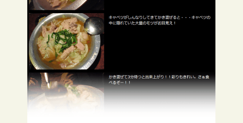
<dt><a href="http://www.flickr.com/photos/22559849@N06/3032375140/" title="モツ鍋@鳥小屋 by php_javascript_room, on Flickr"><img src="http://farm4.static.flickr.com/3223/3032375140_5eba53f7e9_m.jpg" width="240" height="180" alt="モツ鍋@鳥小屋" /></a></dt><dd><p>キャベツたっぷり。ぷりぷりで大きなモツがたっぷり入ったモツ鍋。スープは醤油ベースのみ。1種類ってのがこだわりを感じるわぁ♪鳥小屋のモツ鍋食べるとほんと他店のモツ鍋がものたりなくなるわw</p></dd>
<dt><a href="http://www.flickr.com/photos/22559849@N06/3032375082/" title="モツ鍋@鳥小屋 by php_javascript_room, on Flickr"><img src="http://farm4.static.flickr.com/3239/3032375082_fd66d11941_m.jpg" width="240" height="180" alt="モツ鍋@鳥小屋" /></a></dt><dd><p>キャベツがしんなりしてきてかき混ぜると・・・キャベツの中に隠れていた大量のモツがお目見え!</p></dd>
<dt><a href="http://www.flickr.com/photos/22559849@N06/3032375106/" title="モツ鍋@鳥小屋 by php_javascript_room, on Flickr"><img src="http://farm4.static.flickr.com/3151/3032375106_226d2a6d52_m.jpg" width="240" height="180" alt="モツ鍋@鳥小屋" /></a></dt><dd><p>かき混ぜて3分待つと出来上がり!!彩りもきれい。さぁ食べるぞー!!</p></dd>
<dt><a href="http://www.flickr.com/photos/22559849@N06/3032374922/" title="モツ鍋の〆@鳥小屋 by php_javascript_room, on Flickr"><img src="http://farm4.static.flickr.com/3171/3032374922_8fcb4ea43d_m.jpg" width="240" height="180" alt="モツ鍋の〆@鳥小屋" /></a></dt><dd><p>ちゃんぽん麺か雑炊が選べます!今回はちゃんぽん麺をチョイス!ぱっと見、カルボナーラみたいだけどw麺が太くてコシがあって、醤油ベースのスープとすごく合う!</p></dd>
<dt><a href="http://www.flickr.com/photos/22559849@N06/3032374882/" title="モツ鍋の〆@鳥小屋 by php_javascript_room, on Flickr"><img src="http://farm4.static.flickr.com/3177/3032374882_7b7553fff5_m.jpg" width="240" height="180" alt="モツ鍋の〆@鳥小屋" /></a></dt><dd><p>モツやら野菜やらしいたけやらいろいろなダシが出た後のスープにちゃんぽん麺を投入!スープと麺が絡み合ってめちゃくちゃ美味しかったです!</p></dd>
<dt><a href="http://www.flickr.com/photos/22559849@N06/3032374798/" title="モツ鍋@鳥小屋 by php_javascript_room, on Flickr"><img src="http://farm4.static.flickr.com/3243/3032374798_cec6385d35_m.jpg" width="240" height="180" alt="モツ鍋@鳥小屋" /></a></dt><dd><p>食べ終わった後のモツ鍋。ここにスープを足して、これから〆にまいります!このスープ、きっと何を入れても合うんだろうなってくらい美味しい♪</p></dd>
</dl>
<div id="bottom_fade"></div>
</div>
</body>
</html>
画像に影をつける
2007/8/19
シャドウ用画像:
<style type="text/css">
	/* 親要素 */
	.shadow {
		background-image:url(/content/img/css/shadow.gif);	/* 背景画像を指定 */
		background-repeat:repeat;	/* 背景画像の繰り返し */
		background-position:right bottom;	/* 背景画像の表示位置 */
		float:left;	/* 左寄せ */
		margin:13px 5px 0 5px;	/* 文字との間隔調節 */
		padding:0;
	}
	/*
		親要素から画像をずらした部分が“影”になります。
		left、topの数値が小さくなるほど影が太くなります。
		画像に枠線を付けたい場合は、ボーダープロパティで指定します。
		例) border:1px solid #000;
	*/
	.shadow img {
		position:relative;	/* 親要素から相対位置に表示 */
		left:-3px;	/* 親要素から左に3pxずらす */
		top:-3px;	/* 親要素から右に3pxずらす */
		border:0;	/* 画像の枠線なし */
	}
</style>

<div class="shadow"><img src="/content/img/pic1-thumb.png" alt="ケーキの写真" /></div>
<p>
	シャドウ(影)に使用する画像を1枚用意します。
	そのシャドウ用画像をdiv要素の背景に指定し、そのdiv要素の中にある写真画像を、そのdiv要素から左上に少しずらして表示することで画像を浮き出た感じに見せています。
</p>
<p>
	ずらしが大きいほど影が大きくなります。シャドウ用画像は5px四方のグレーの背景画像を使用しています。
	シャドウは、写真の大きさに合わせて伸縮します。
</p>
<br clear="all" /><!-- 画像の回り込みを解除したい位置に挿入 -->

<div class="shadow"><img src="/content/img/pic1.png" alt="ケーキの写真" /></div>
<p>
	シャドウ(影)に使用する画像を1枚用意します。
	そのシャドウ用画像をdiv要素の背景に指定し、そのdiv要素の中にある写真画像を、そのdiv要素から左上に少しずらして表示することで画像を浮き出た感じに見せています。
</p>
<p>
	ずらしが大きいほど影が大きくなります。シャドウ用画像は5px四方のグレーの背景画像を使用しています。
	シャドウは、写真の大きさに合わせて伸縮します。
</p>
<br clear="all" /><!-- 画像の回り込みを解除したい位置に挿入 -->
シャドウ(影)に使用する画像を1枚用意します。 そのシャドウ用画像をdiv要素の背景に指定し、そのdiv要素の中にある写真画像を、そのdiv要素から左上に少しずらして表示することで画像を浮き出た感じに見せています。
ずらしが大きいほど影が大きくなります。シャドウ用画像は5px四方のグレーの背景画像を使用しています。 シャドウは、写真の大きさに合わせて伸縮します。
シャドウ(影)に使用する画像を1枚用意します。 そのシャドウ用画像をdiv要素の背景に指定し、そのdiv要素の中にある写真画像を、そのdiv要素から左上に少しずらして表示することで画像を浮き出た感じに見せています。
ずらしが大きいほど影が大きくなります。シャドウ用画像は5px四方のグレーの背景画像を使用しています。 シャドウは、写真の大きさに合わせて伸縮します。