CSSデザイン角丸ボックス・吹き出し
- Sweet Rounded Corners〔1枚画像(枠線ありなし可)、JavaScript使用〕
- Simple Round corners〔小さな円形の画像1枚でできるシンプルな角丸ボックス〕
- Snazzy Borders〔CSSのみの角丸ボックス〕
- Spiffy Box〔背景画像・div要素使用〕
- The ThrashBox™〔背景画像・div要素使用〕
- 角丸テーブル〔背景画像・table要素使用〕
- 角丸テーブル〔スタイルシートのみ〕
- 角丸テーブル〔クラス名の指定を変えるだけでカラーチェンジ!〕
Sweet Rounded Corners
1枚画像(枠線ありなし可)、JavaScript使用
2008/1/24
Simple Round corners
枠線の色や背景色、角の大きさなどを指定すると、角丸画像とコピペできるソースを出力してくれる角丸ジェレネレータ。
楕円形の角丸画像をCSSで四隅に配置して、JavaScriptでコンテンツ上下に角丸部分のタグを自動挿入するため、ソースがいたってシンプルな角丸ボックスを作成することができます。 角丸ボックスは、角丸内のコンテンツ量に応じて伸縮します。それくらいの幅まで対応させるかは、角丸画像生成時に角丸ボックスの最大幅をMax Stretch Width(ピクセル指定)で調整すればOK。
 設置イメージ
<style type="text/css">
/* curve height, background image */
.myClassName .t,
.myClassName .b,
.myClassName .b b,
.myClassName .t b {
    height:10px;
    background:transparent url(/content/img/css/ffffffeeeeeecccccc1101600.png) no-repeat 0 0;
}
/* inner color, border color, border width */
.myClassName .c {
    background:#eeeeee;
    border-color:#cccccc;
    border-left-width:1px;
    border-right-width:1px;
}
/* surrounding margins (optional) */
.round {
    margin-bottom:5px;
}
.round .c {
/* inner content padding */
    padding:0 10px;
    border-top:0;
    border-bottom:0;
    border-style:solid;
}
.round .t,
.round .b,
.round .t b,
.round .b b {
    display:block;
    overflow:hidden;
}
.round .t b, .round .b b {
    float:right;
    width:50%;
}
.round .t .r {
    background-position:top right;
}
.round .b .r {
    background-position:bottom right;
}
.round .b {
    background-position:bottom left;
}
.round .b r{
    clear:both;
    display:block;
    overflow:hidden;
    height:0;
}
</style>
<script type="text/javascript">
    var makeRound=function(){
        var els=document.getElementsByTagName('div');
        for(var i=0; el=els[i]; i++){
            if(el.className.indexOf('round')>-1
            && el.firstChild
            && el.firstChild.className!='t'){
                el.innerHTML='<b class="t"><b class="r"></b></b><div class="c"><b class="br"></b>'+el.innerHTML+'<b class="br"></b></div><b class="b"><b class="r"><!----></b></b>';
            }
        }
    }
    window.onload=makeRound;
</script>

<div class="round myClassName">
...content...<br>...content...<br>...content...
</div>

<!-- works with both padding and margins -->
<div class="round myClassName" style="width:50%;">
    <div style="padding:10px;">...content...<br>...content...<br>...content...</div>
</div>
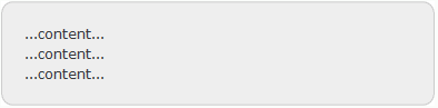
...content...
...content...
...content...
...content...
Simple Round corners
小さな円形の画像1枚でできるシンプルな角丸ボックス
2008/12/7
Simple Round corners
下記のような小さな円形画像1枚で角丸ボックスを作れるCSSテクニックが掲載されています。 サンプルそのままだと、サイトによってはもともと定義しているCSSとのかねあいで表示が多少くずれます。 そのため、CSSでブラウザごと(特にIE6)の微調整をしないといけないのが難点。 画像1枚で枠付きの角丸がサクッとできるのはとっても便利なのですがw
 設置イメージ
<style type="text/css">
.srcbox{
    background:#fff;
    padding:0 9px;
    margin:30px auto;
    position:relative;
    top:0; left:0;
    border:1px solid #fff;/* stop margin collapse*/
    border-left:1px solid #000;
    border-right:1px solid #000;
    z-index:2;
    min-height:0;/* ie7 haslayout fix*/
}
.srcbox p {
    padding:10px;
    margin:0 0 8px 0;
}
.srcbox .inner{
    background:#fff;
    padding-top:10px!important;
    padding-bottom:10px!important;
    margin-top:-10px!important;
    margin-bottom:-10px!important;
    min-height:0;/* ie7 haslayout issues fix*/
    position:relative;
    top:0; left:0;
    border-top:1px solid #000;
    border-bottom:1px solid #000;
    z-index:2
}
.srcbox .top,
.srcbox .base{
    margin:-11px -10px 0 -10px;
    background:url(/content/img/css/bordercorner.png) no-repeat left top;
    height:10px;
    position:relative;
    top:0; left:0;
    clear:both;
    z-index:-1;/* drag corner under background*/
}
.srcbox .base{
    background-position:left bottom;
    margin:0 -10px -11px -10px;
}
.srcbox .top span,
.srcbox .base span{
    background:url(/content/img/css/bordercorner.png) no-repeat right top;
    display:block;
    height:10px;
}
.srcbox .base span {
    background-position:right bottom;
}
.srcbox .content {
    width:100%;
    background:#fff;
    margin:-9px 0 -17px 0;
    padding:0;
}
/* for ie6 */
* html .srcbox .inner,
* html .srcbox {
    height:1px;/* ie6 haslayout issues fix*/
}
* html .srcbox .content {
    margin:-20px 0 -15px 0;
    padding-top:10px;
    padding-bottom:0;
}

</style>
<div class="srcbox">
    <div class="inner">
        <div class="top"><span></span></div>
        <div class="content">
            <p style="margin-bottom:0; padding-bottom:0;"><img src="http://farm4.static.flickr.com/3141/2973155055_4cf4370939_s.jpg" align="right" style="margin:0 0 5px 5px;">新宿高島屋のサザンテラスにいつも長蛇の列を作っている人気のドーナツ屋さん<strong>「クリスピー・クリーム・ドーナツ」</strong>。</p>
            <p>ドーナツの箱がピザの箱みたいで、味もアメリカン!ビジュアルから行ってさぞかし劇甘なんだろうなと思ったけど、意外とほどよい甘さ。生地はかなりソフトなので固めでサクサクしたドーナツが好きな人にはおすすめできないかもw<br clear="all" /></p>
        </div>
        <div class="base"><span></span></div>
    </div>
</div>
 新宿高島屋のサザンテラスにいつも長蛇の列を作っている人気のドーナツ屋さん「クリスピー・クリーム・ドーナツ」。
ドーナツの箱がピザの箱みたいで、味もアメリカン!ビジュアルから行ってさぞかし劇甘なんだろうなと思ったけど、意外とほどよい甘さ。生地はかなりソフトなので固めでサクサクしたドーナツが好きな人にはおすすめできないかもw
Snazzy Borders
CSSのみの角丸ボックス
2008/1/24
Snazzy Borders
Nifty Cornersベースの角丸ボックス。 空のb要素を使用して、CSSのみで角丸テーブルを作成する方法が掲載されています。 背景色、ボーダー色などの変更が簡単にできます。
<style type="text/css">
    /* Snazzy Borders - http://www.cssplay.co.uk/boxes/snazzy.html */
    #xsnazzy { background:transparent; margin:1em; padding:0; }
    #xsnazzy .h, #xsnazzy p { margin:0; padding:10px 15px; line-height:2em; }
    #xsnazzy .h { font-size:1.5em; color:#60c8d8; padding-bottom:0; font-weight:bold; }
    #xsnazzy .xtop, #xsnazzy .xbottom {display:block; background:transparent; font-size:1px; }
    #xsnazzy b { display:block; overflow:hidden; }
    #xsnazzy .xb1, #xsnazzy .xb2, #xsnazzy .xb3 {height:1px; }
    #xsnazzy .xb2, #xsnazzy .xb3, #xsnazzy .xb4 {background:#f2f9fd; border-left:1px solid #c8ebf9; border-right:1px solid #c8ebf9; }
    #xsnazzy .xb1 { margin:0 5px; background:#c8ebf9; }
    #xsnazzy .xb2 { margin:0 3px; border-width:0 2px; }
    #xsnazzy .xb3 { margin:0 2px; }
    #xsnazzy .xb4 { height:2px; margin:0 1px; }
    #xsnazzy .xboxcontent { display:block; background:#f2f9fd; border:0 solid #c8ebf9; border-width:0 1px; }
</style>
<div id="xsnazzy">
    <b class="xtop"><b class="xb1"></b><b class="xb2"></b><b class="xb3"></b><b class="xb4"></b></b>
    <div class="xboxcontent">
        <div class="h">クリスピー・クリーム・ドーナツ</div>
        <p>新宿高島屋のサザンテラスにいつも長蛇の列を作っている人気のドーナツ屋さん<strong>「クリスピー・クリーム・ドーナツ」</strong>。ドーナツの箱がピザの箱みたいで、味もアメリカン!ビジュアルから行ってさぞかし劇甘なんだろうなと思ったけど、意外とほどよい甘さ。生地はかなりソフトなので固めでサクサクしたドーナツが好きな人にはおすすめできないかもw</p>
    </div>
    <b class="xbottom"><b class="xb4"></b><b class="xb3"></b><b class="xb2"></b><b class="xb1"></b></b>
</div>
新宿高島屋のサザンテラスにいつも長蛇の列を作っている人気のドーナツ屋さん「クリスピー・クリーム・ドーナツ」。ドーナツの箱がピザの箱みたいで、味もアメリカン!ビジュアルから行ってさぞかし劇甘なんだろうなと思ったけど、意外とほどよい甘さ。生地はかなりソフトなので固めでサクサクしたドーナツが好きな人にはおすすめできないかもw
Spiffy Box
背景画像・div要素使用
2008/1/24
Spiffy Box - Simple Rounded Corner CSS Boxes made easy.
1枚の角丸画像(500px×500px)をボックスの背景画像にずらしながら指定することで角丸テーブルにしています。 伸縮自在です。
<style type="text/css">
    /* Spiffy Box - http://www.spiffybox.com/index.php */
    .cnbox, .cnbox_body, .cnbox_head, .cnbox_head div {
        background:transparent url(/content/img/css/corner3.gif) no-repeat bottom right;
    }
    .cnbox{
        width:335px !important; width: 320px;
        margin:5px auto; padding-right:15px;
    }
    .cnbox_head {
        background-position:top right;
        margin-right:-15px;
        padding-right:40px;
    }
        .cnbox_head div {
            background-position:top left;
            margin:0; padding:10px 0 5px 20px;
            border:0;
            height:auto !important; height:1%;
            color:#fff; font-weight:bold; font-size:1.5em;
        }
    .cnbox_body {
        background-position:bottom left;
        margin-right:25px; padding:5px 0 10px 20px;
    }
</style>

<div class="cnbox">
    <div class="cnbox_head">
        <div>This is a header</div>
    </div>
    <div class="cnbox_body">
        <p>This is for your content.</p>
        <p>This is for your content.</p>
        <p>This is for your content.</p>
    </div>
</div>
This is for your content.
This is for your content.
This is for your content.
The ThrashBox™
背景画像・div要素使用
2008/1/24
The ThrashBox™
背景画像とdiv要素を使用した角丸ボックスを作成する方法が掲載されています。 空要素を使用していないのでXHTMLでも文法クリアです。 背景画像のサンプルは、PSD形式できます。
<style type="text/css">
/* The ThrashBox - http://www.vertexwerks.com/tests/sidebox/ */
/* Show only to IE PC \*/
* html #sidebox .boxhead h2 {height: 1%;} /* For IE 5 PC */

#sidebox {
    margin: 0 auto; /* center for now */
    background: url(/content/img/css/thrashbox/sbbody-r.gif) no-repeat bottom right;
    font-size: 100%;
    max-width:630px;
}
#sidebox .boxhead {
    background: url(/content/img/css/thrashbox/sbhead-r.gif) no-repeat top right;
    margin: 0;
    padding: 0;
    text-align: center;
}
#sidebox .boxhead .h {
    background: url(/content/img/css/thrashbox/sbhead-l.gif) no-repeat top left;
    margin: 0;
    padding: 22px 30px 5px;
    color: white;
    font-weight: bold;
    font-size: 1.2em;
    line-height: 1em;
    text-shadow: rgba(0,0,0,.4) 0px 2px 5px; /* Safari-only, but cool */
}
#sidebox .boxbody {
    background: url(/content/img/css/thrashbox/sbbody-l.gif) no-repeat bottom left;
    margin: 0;
    padding: 5px 30px 31px;
}
#sidebox .boxbody p {
    margin:0; padding:10px 0 5px 0;
}
</style>
<div id="sidebox">
    <div class="boxhead"><div class="h">クリスピー・クリーム・ドーナツ</div></div>
    <div class="boxbody">
        <p>新宿高島屋のサザンテラスにいつも長蛇の列を作っている人気のドーナツ屋さん<strong>「クリスピー・クリーム・ドーナツ」</strong>。</p>
        <p>ドーナツの箱がピザの箱みたいで、味もアメリカン!ビジュアルから行ってさぞかし劇甘なんだろうなと思ったけど、意外とほどよい甘さ。生地はかなりソフトなので固めでサクサクしたドーナツが好きな人にはおすすめできないかもw</p>
    </div>
</div>
新宿高島屋のサザンテラスにいつも長蛇の列を作っている人気のドーナツ屋さん「クリスピー・クリーム・ドーナツ」。
ドーナツの箱がピザの箱みたいで、味もアメリカン!ビジュアルから行ってさぞかし劇甘なんだろうなと思ったけど、意外とほどよい甘さ。生地はかなりソフトなので固めでサクサクしたドーナツが好きな人にはおすすめできないかもw
角丸テーブル
背景画像・table要素使用
2008/1/24
使用している画像は、
 と透過GIF(1px*1px)です。
<style type='text/css'>
    div.km img          { border:none; display:block; }
    div.km table {
        margin:0; padding:0;
        border:0;
        border-collapse:collapse;
    }
    div.km table th,
    div.km table td {
        margin:0; padding:0;
        border:0;
    }
    /* 左上角 */
    div.km td.top_left  { background:url(/content/img/css/km_top_left.gif) no-repeat; }
    /* 右上角 */
    div.km td.top_right { background:url(/content/img/css/km_top_right.gif) no-repeat; }
    /* 左下角 */
    div.km td.btm_left  { background:url(/content/img/css/km_btm_left.gif) no-repeat; }
    /* 右下角 */
    div.km td.btm_right { background:url(/content/img/css/km_btm_right.gif) no-repeat; }
    /* 上部、下部 */
    div.km td.center    { background:url(/content/img/css/km_center.gif) repeat-x; }
    /* 左部、右部 */
    div.km td.side      { background:url(/content/img/css/km_side.gif) repeat-y; }
    /* 中身 */
    div.km td.content   { background-color:#bddfff; line-height:1.5; }
</style>

<div class="km">
    <table width="80%">
        <tr>
            <td class="top_left" width="10"><img src='/content/img/clr.gif' width="10" height="10" alt="" /></td>
            <td class="center" width="*"></td>
            <td class="top_right" width="10"><img src='/content/img/clr.gif' width="10" height="10" alt="" /></td>
        </tr>
        <tr>
            <td class="side" width="10"></td>
            <td class="content">
                ここに文章などを記述します。<br>
                テーブルサイズは自由に設定可。<br>
                幅はTABLEタグのwidth属性で400pxに指定しています。<br>
                高さは文字の量に合わせて伸縮します。
            </td>
            <td class="side" width="10"></td>
        </tr>
        <tr>
            <td class="btm_left" width="10"><img src='/content/img/clr.gif' width="10" height="10" alt="" /></td>
            <td class="center" width="*"></td>
            <td class="btm_right" width="10"><img src='/content/img/clr.gif' width="10" height="10" alt="" /></td>
        </tr>
    </table>
</div>
 |
|
|
|
ここに文章などを記述します。 テーブルサイズは自由に設定可。 幅はTABLEタグのwidth属性で400pxに指定しています。 高さは文字の量に合わせて伸縮します。 |
||
|
|
角丸テーブル
スタイルシートのみ
2008/1/24
<style type="text/css">
    /*------------------------------ 角丸CSS */
    .kado  { background-color:#fff; }
    .kado1 { margin: 0 5px;height:1px;overflow: hidden; background-color:#e8e8e8; }
    .kado2 { margin: 0 3px;height:1px;overflow: hidden; background-color:#e8e8e8; }
    .kado3 { margin: 0 2px;height:1px;overflow: hidden; background-color:#e8e8e8; }
    .kado4 { margin: 0 1px;height:2px;overflow: hidden; background-color:#e8e8e8; }
    .kado5 { padding:10px; background-color:#e8e8e8; }
</style>

<div style="width:80%">
    <div class="kado">
        <div class="kado1"></div>
        <div class="kado2"></div>
        <div class="kado3"></div>
        <div class="kado4"></div>
    </div>
    <div class="kado5">
    <!-- 文章などを記述 -->CSSのみの角丸テーブルです。
    </div>
    <div class="kado">
        <div class="kado4"></div>
        <div class="kado3"></div>
        <div class="kado2"></div>
        <div class="kado1"></div>
    </div>
</div>
角丸テーブル
クラス名の指定を変えるだけでカラーチェンジ!
2008/1/24
 サンプル
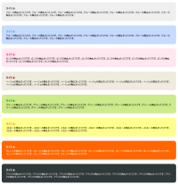
サンプルdiv要素を入れ子にして、四隅に背景画像を使用した伸縮自在の角丸ボックスです。 外枠のクラス名(cngray | cnyellow | cnblue | cnpink | cnblack | cnbeige | cngreen | cnorange)を切り替えるだけで、カラーチェンジできます。 サイズを固定したい場合は、外枠のスタイルに幅・高さを指定してください。
1つのカラー各カラーにつき私用している背景画像は、「topL.gif」、「topR.gif」、「btmL.gif」、「btmR.gif」の4枚です。 以下は、黒い角丸ボックスで使用している背景画像です。
このサンプルで使用している画像は、枠の曲線の内側を透過しているため、すべて白背景専用です。
<!DOCTYPE html PUBLIC "-//W3C//DTD XHTML 1.0 Transitional//EN" "http://www.w3.org/TR/xhtml1/DTD/xhtml1-transitional.dtd">
<html xmlns="http://www.w3.org/1999/xhtml" xml:lang="ja" lang="ja">
<head>
<meta http-equiv="Content-Type" content="text/html; charset=utf-8" />
<title>角丸ボックス(背景画像・div要素使用・白背景用・カラーバリエーション有) | PHP & JavaScript Room</title>
<meta http-equiv="Content-Language" content="ja" />
<meta http-equiv="Content-Script-Type" content="text/javascript" />
<meta http-equiv="Content-Style-Type" content="text/css" />
<meta http-equiv="imagetoolbar" content="no" />
<meta name="copyright" content="Copyright (c) PHP & JavaScript Room" />
<link rel="shortcut icon" href="/favicon.ico" type="image/x-icon" />
<link rel="stylesheet" type="text/css" href="/module/include/css/kadomaru/cnbox/cnbox.css" />
<style type="text/css">
body {
    margin:0 auto; padding:0;
    background:#fff url(/content/img/skin/bg.gif) repeat top left;
    font-family:verdana,sans-serif;
    font-size:81%;
    text-align:center;
}
div.wrap {
    margin:0 auto; padding:20px 0;
    width:80%;
    text-align:center;
}
</style>
</head>
<body>
<div class="wrap">
<h1>div要素と四隅画像で作る角丸テーブル</h1>
<!-- div.cngray [start] -->
<div class="cngray">
    <div class="cntop_l">
        <div class="cntop_r">
            <div class="cnbtm">
                <div class="cnbody">
                    <!-- start -->
                    <dl>
                        <dt>タイトル</dt>
                        <dd>ブルーの角丸ボックスです。ブルーの角丸ボックスです。ブルーの角丸ボックスです。ブルーの角丸ボックスです。ブルーの角丸ボックスです。ブルーの角丸ボックスです。ブルーの角丸ボックスです。ブルーの角丸ボックスです。ブルーの角丸ボックスです。</dd>
                    </dl>
                    <!-- end // -->
                </div>
            </div>
        </div>
    </div>
</div>
<!-- div.cngray [end] // -->

<!-- div.cnblue [start] -->
<div class="cnblue">
    <div class="cntop_l">
        <div class="cntop_r">
            <div class="cnbtm">
                <div class="cnbody">
                    <!-- start -->
                    <dl>
                        <dt>タイトル</dt>
                        <dd>ブルーの角丸ボックスです。ブルーの角丸ボックスです。ブルーの角丸ボックスです。ブルーの角丸ボックスです。ブルーの角丸ボックスです。ブルーの角丸ボックスです。ブルーの角丸ボックスです。ブルーの角丸ボックスです。ブルーの角丸ボックスです。</dd>
                    </dl>
                    <!-- end // -->
                </div>
            </div>
        </div>
    </div>
</div>
<!-- div.cnblue [end] // -->

<!-- div.cnpink [start] -->
<div class="cnpink">
    <div class="cntop_l">
        <div class="cntop_r">
            <div class="cnbtm">
                <div class="cnbody">
                    <!-- start -->
                    <dl>
                        <dt>タイトル</dt>
                        <dd>ピンクの角丸ボックスです。ピンクの角丸ボックスです。ピンクの角丸ボックスです。ピンクの角丸ボックスです。ピンクの角丸ボックスです。ピンクの角丸ボックスです。ピンクの角丸ボックスです。ピンクの角丸ボックスです。ピンクの角丸ボックスです。</dd>
                    </dl>
                    <!-- end // -->
                </div>
            </div>
        </div>
    </div>
</div>
<!-- div.cnpink [end] // -->

<!-- div.cnbeige [start] -->
<div class="cnbeige">
    <div class="cntop_l">
        <div class="cntop_r">
            <div class="cnbtm">
                <div class="cnbody">
                    <!-- start -->
                    <dl>
                        <dt>タイトル</dt>
                        <dd>ベージュの角丸ボックスです。ベージュの角丸ボックスです。ベージュの角丸ボックスです。ベージュの角丸ボックスです。ベージュの角丸ボックスです。ベージュの角丸ボックスです。ベージュの角丸ボックスです。ベージュの角丸ボックスです。ベージュの角丸ボックスです。</dd>
                    </dl>
                    <!-- end // -->
                </div>
            </div>
        </div>
    </div>
</div>
<!-- div.cnbeige [end] // -->

<!-- div.cngreen [start] -->
<div class="cngreen">
    <div class="cntop_l">
        <div class="cntop_r">
            <div class="cnbtm">
                <div class="cnbody">
                    <!-- start -->
                    <dl>
                        <dt>タイトル</dt>
                        <dd>グリーンの角丸ボックスです。グリーンの角丸ボックスです。グリーンの角丸ボックスです。グリーンの角丸ボックスです。グリーンの角丸ボックスです。グリーンの角丸ボックスです。グリーンの角丸ボックスです。グリーンの角丸ボックスです。グリーンの角丸ボックスです。</dd>
                    </dl>
                    <!-- end // -->
                </div>
            </div>
        </div>
    </div>
</div>
<!-- div.cngreen [end] // -->

<!-- div.cnyellow [start] -->
<div class="cnyellow">
    <div class="cntop_l">
        <div class="cntop_r">
            <div class="cnbtm">
                <div class="cnbody">
                    <!-- start -->
                    <dl>
                        <dt>タイトル</dt>
                        <dd>イエローの角丸ボックスです。イエローの角丸ボックスです。イエローの角丸ボックスです。イエローの角丸ボックスです。イエローの角丸ボックスです。イエローの角丸ボックスです。イエローの角丸ボックスです。イエローの角丸ボックスです。イエローの角丸ボックスです。</dd>
                    </dl>
                    <!-- end // -->
                </div>
            </div>
        </div>
    </div>
</div>
<!-- div.cnyellow [end] // -->

<!-- div.cnorange [start] -->
<div class="cnorange">
    <div class="cntop_l">
        <div class="cntop_r">
            <div class="cnbtm">
                <div class="cnbody">
                    <!-- start -->
                    <dl>
                        <dt>タイトル</dt>
                        <dd>オレンジの角丸ボックスです。オレンジの角丸ボックスです。オレンジの角丸ボックスです。オレンジの角丸ボックスです。オレンジの角丸ボックスです。オレンジの角丸ボックスです。オレンジの角丸ボックスです。オレンジの角丸ボックスです。オレンジの角丸ボックスです。</dd>
                    </dl>
                    <!-- end // -->
                </div>
            </div>
        </div>
    </div>
</div>
<!-- div.cnorange [end] // -->

<!-- div.cnblack [start] -->
<div class="cnblack">
    <div class="cntop_l">
        <div class="cntop_r">
            <div class="cnbtm">
                <div class="cnbody">
                    <!-- start -->
                    <dl>
                        <dt>タイトル</dt>
                        <dd>ブラックの角丸ボックスです。ブラックの角丸ボックスです。ブラックの角丸ボックスです。ブラックの角丸ボックスです。ブラックの角丸ボックスです。ブラックの角丸ボックスです。ブラックの角丸ボックスです。ブラックの角丸ボックスです。ブラックの角丸ボックスです。</dd>
                    </dl>
                    <!-- end // -->
                </div>
            </div>
        </div>
    </div>
</div>
<!-- div.cnblack [end] // -->

</div>
</body>
</html>