CSSデザインCSSボタン
3D Button Effect
unknown
3D Button Effect
CSSで立体的なボタンを作る方法が掲載されています。
a要素とspan要素を使用し、a要素にマウスオーバーした時に、a要素の枠線色とspan要素の枠線色と背景画像を変更することで、凹凸のあるボタンを作成することができます。 使用している画像は、「通常時の背景画像」と「マスウオーバー時の背景画像」の2枚です。
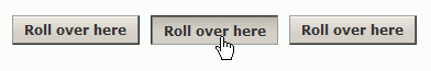 設置イメージ
設置サンプルサンプルを見る
<style type="text/css">
/* 通常時 */
a.button3d {
    font-weight:bold;
    border:1px solid #999;
    border-right-color:#333;
    border-bottom-color:#333;
    color:#333;
    width:auto;
    text-decoration:none;
    float:left;
    margin-right:10px;
}
/* マウスオーバー時 */
a.button3d:hover {
    border:1px solid #333;
    border-right-color:#999;
    border-bottom-color:#999;
    color:#333;
}
/* 通常時のspan要素 */
a.button3d span {
    background:#d4d0c8 url(/content/img/css/bg_3d_effect_button.gif) repeat-x 0 0;
    float:left;
    line-height:24px;
    height:24px;
    padding:0 10px;
    border-right:1px solid #777;
    border-bottom:1px solid #777;
}
/* マウスオーバー時のspan要素 */
a.button3d:hover span {
    border:none;
    border-top:1px solid #777;
    border-left:1px solid #777;
    background:#d4d0c8 url(/content/img/css/bg_3d_effect_button_over.gif) repeat-x 0 0;
    cursor:pointer;
}
</style>

<a href="#" class="button3d"><span>Roll over here</span></a>
<a href="#" class="button3d"><span>Roll over here</span></a>
<a href="#" class="button3d"><span>Roll over here</span></a>
<br clear="all" />
3D Button Effect
unknown
3D Button Effect
CSSで立体的なボタンを作る方法が掲載されています。
a要素とspan要素を使用し、a要素にマウスオーバーした時に、a要素の枠線色とspan要素の枠線色と背景画像を変更することで、凹凸のあるボタンを作成することができます。 使用している画像は、「通常時の背景画像」と「マスウオーバー時の背景画像」の2枚です。
設置イメージ設置サンプルサンプルを見る
<style type="text/css">
/* 通常時 */
a.button3d {
    font-weight:bold;
    border:1px solid #999;
    border-right-color:#333;
    border-bottom-color:#333;
    color:#333;
    width:auto;
    text-decoration:none;
    float:left;
    margin-right:10px;
}
/* マウスオーバー時 */
a.button3d:hover {
    border:1px solid #333;
    border-right-color:#999;
    border-bottom-color:#999;
    color:#333;
}
/* 通常時のspan要素 */
a.button3d span {
    background:#d4d0c8 url(/content/img/css/bg_3d_effect_button.gif) repeat-x 0 0;
    float:left;
    line-height:24px;
    height:24px;
    padding:0 10px;
    border-right:1px solid #777;
    border-bottom:1px solid #777;
}
/* マウスオーバー時のspan要素 */
a.button3d:hover span {
    border:none;
    border-top:1px solid #777;
    border-left:1px solid #777;
    background:#d4d0c8 url(/content/img/css/bg_3d_effect_button_over.gif) repeat-x 0 0;
    cursor:pointer;
}
</style>

<a href="#" class="button3d"><span>Roll over here</span></a>
<a href="#" class="button3d"><span>Roll over here</span></a>
<a href="#" class="button3d"><span>Roll over here</span></a>
<br clear="all" />
1枚の画像のロールオーバーボタン
unknown
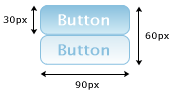
「通常時のボタン画像」と「マウスが乗った時のボタン画像」を1枚の画像にしておき、リンクの状態によってCSSで画像の表示位置を移動します。 マウスが乗った時(:hover)の画像があらかじめ読み込まれているため、画像の切り替えがスムーズに行きます。
<style type="text/css">
	a.rob {
		display:block;
		margin:10px; padding:0;
		width:90px; height:30px;
		background:transparent url(/content/img/css/button.png) no-repeat 0 0;
		text-decoration:none;
		text-indent:-9999px;
	}
	a.rob:hover {
		background-position:0 -30px;
		text-decoration:none;
	}
</style>

<a href="#" class="rob">Button</a>
PNG画像と背景色を使用した伸縮するCSSボタン
unknown
Scalable CSS Buttons Using PNG and Background Colors
IE6未対応
[JS]btn.js、[画像]btn2.png、shade.png
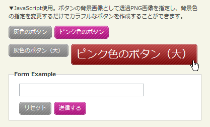
JavaScriptを使用して、ボタンの背景画像に透過PNG画像を適用し、角丸の伸縮可能なCSSボタンを作成する方法が掲載されています。
ロールオーバー時や色付きボタンを作成するのに別途画像を用意することなく、CSSでボタンの色を簡単に変更することができます。
 設置イメージ
Scalable CSS Buttons Using PNG and Background Colorsの設置サンプルサンプルを見る
<!DOCTYPE html PUBLIC "-//W3C//DTD XHTML 1.0 Transitional//EN" "http://www.w3.org/TR/xhtml1/DTD/xhtml1-transitional.dtd">
<html xmlns="http://www.w3.org/1999/xhtml" xml:lang="ja" lang="ja">
    <head>
        <meta http-equiv="Content-Type" content="text/html; charset=utf-8" />
        <meta http-equiv="Content-Language" content="ja" />
        <meta http-equiv="Content-Script-Type" content="text/javascript" />
        <meta http-equiv="Content-Style-Type" content="text/css" />
        <meta http-equiv="imagetoolbar" content="no" />
        <title>Scalable CSS Buttons Using PNG and Background Colors | 設置サンプル</title>
        <link rel="stylesheet" type="text/css" href="/content/lib/global.css" />
        <!-- JS -->
        <script type="text/javascript" src="/content/jslib/btn.js"></script>
        <!-- CSS -->
        <style type="text/css">
            .btn { display: block; position: relative; background: #aaa; padding: 5px; float: left; color: #fff; text-decoration: none; cursor: pointer; }
            .btn * { font-style: normal; background-image: url(/content/img/css/btn2.png); background-repeat: no-repeat; display: block; position: relative; }
            .btn i { background-position: top left; position: absolute; margin-bottom: -5px;  top: 0; left: 0; width: 5px; height: 5px; }
            .btn span { background-position: bottom left; left: -5px; padding: 0 0 5px 10px; margin-bottom: -5px; }
            .btn span i { background-position: bottom right; margin-bottom: 0; position: absolute; left: 100%; width: 10px; height: 100%; top: 0; }
            .btn span span { background-position: top right; position: absolute; right: -10px; margin-left: 10px; top: -5px; height: 0; }

            * html .btn span,
            * html .btn i { float: left; width: auto; background-image: none; cursor: pointer; }

            .btn.pink { background: #e1a; }
            .btn:hover { background-color: #a00; }
            .btn:active { background-color: #444; }
            .btn[class] { background-image: url(/content/img/css/shade.png); background-position: bottom; }

            * html .btn { border: 3px double #aaa; }
            * html .btn.pink { border-color: #e1a; }
            * html .btn:hover { border-color: #a00; }

            form, p { clear:both; float:none; margin:10px; overflow:hidden; }
            .btn { margin-right:5px; }
        </style>
    </head>
    <body>
        <div id="wrap">
        <h1><a href='http://monc.se/kitchen/59/scalable-css-buttons-using-png-and-background-colors'>Scalable CSS Buttons Using PNG and Background Colors</a> | 設置サンプル</h1>
        <p>▼JavaScript使用。ボタンの背景画像として透過PNG画像を指定し、背景色の指定を変更するだけでカラフルなボタンを作成することができます。</p>
<!-- CODE -->
        <p><a href="#" class="btn">灰色のボタン</a> <a href="#" class="btn pink">ピンク色のボタン</a></p>
        <p><a href="#" class="btn big">灰色のボタン(大)</a> <a href="#" class="btn pink" style="font-size:200%;">ピンク色のボタン(大)</a></p>
        <form action="#" onsubmit="return false;">
            <fieldset>
                <legend>Form Example</legend>
                <p><input type="text" /></p>
                <p>
                    <input type="button" value="リセット" class="btn" />
                    <input type="submit" value="送信する" class="btn pink" />
                </p>
            </fieldset>
        </form>
<!-- / CODE -->
    </body>
</html>