CSS3デザインCSS3ボタン
- 光るボタン
- CSS3 Gradient Buttons〔クロスブラウザ対応のグラデーションボタン〕
- Better Button and Nav Interactions〔フェード効果付きの角丸ボタン〕
- CSS3 Buttons Without Any Images〔button要素を角丸ボタンに〕
- Super Awesome Buttons with CSS3 and RGBA〔角丸ボタン〕
- Nice CSS3 buttons〔背景色が変えられるボタン〕
- lovely Candy CSS3 buttons〔ラムネ菓子みたいな可愛いボタン〕
- Animated Bubble Buttons CSS3〔マウスオーバーで背景の泡がアニメーションするシャンパンみたいなボタン〕
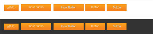
CSS3 Gradient Buttons
クロスブラウザ対応のグラデーションボタン
unknown
CSS3 Gradient Buttons
画像、JSは一切使用せずに、クロスブラウザ対応のグラデーションボタンを作成する方法が掲載されています。
div, span, p, a, button, inputなどさまざまなHTML要素に指定可能です。 IEではCSS3未対応のため角丸にはなりませんが、フィルタを使用してグラデーション効果を与えています。
filter:progid:DXImageTransform.Microsoft.gradient(
 フィルタの有無(1=有効,0=無効),
 グラデーションの方向(0=垂直方向,1=水平方向)
 グラデーション開始色(#RRGGBB),
 グラデーション終了色(#RRGGBB)
)
 IE
IE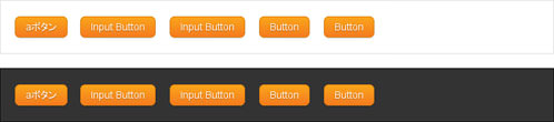 Chrome
 Safari
<h4>参考:<a href='http://www.webdesignerwall.com/tutorials/css3-gradient-buttons/' target='_blank'>CSS3 Gradient Buttons</a></h4>
<style type="text/css">
#dark {
    background-color:#333;
    border:1px solid #000;
    margin:20px auto; padding:20px;
    color:#fff;
}
#light{
    background-color:#fff;
    border:1px solid #dedede;
    margin:20px auto; padding:20px;
}
.button,
.button:visited {
    display: inline-block;
    outline: none;
    cursor: pointer;
    color:#fff!important;
    text-decoration:none;
    text-align: center;
    text-decoration: none;
    font: 14px/100% Arial, Helvetica, sans-serif;
    padding: .5em 1em .55em;
    text-shadow: 0 1px 1px rgba(0,0,0,.3);
    background:#eee;
    -webkit-border-radius: .5em;
    -moz-border-radius: .5em;
    border-radius: .5em;
    -webkit-box-shadow: 0 1px 2px rgba(0,0,0,.2);
    -moz-box-shadow: 0 1px 2px rgba(0,0,0,.2);
    box-shadow: 0 1px 2px rgba(0,0,0,.2);
}
.button:hover {
    text-decoration: none;
}
.button:active {
    position: relative;
    top: 1px;
}
.orange {
    color: #fef4e9;
    border: solid 1px #da7c0c;
    background: #f78d1d;
    background: -webkit-gradient(linear, left top, left bottom, from(#faa51a), to(#f47a20));
    background: -moz-linear-gradient(top,  #faa51a,  #f47a20);
    filter:  progid:DXImageTransform.Microsoft.gradient(startColorstr='#faa51a', endColorstr='#f47a20');
}
.orange:hover {
    background: #f47c20;
    background: -webkit-gradient(linear, left top, left bottom, from(#f88e11), to(#f06015));
    background: -moz-linear-gradient(top,  #f88e11,  #f06015);
    filter:  progid:DXImageTransform.Microsoft.gradient(startColorstr='#f88e11', endColorstr='#f06015');
}
.orange:active {
    color: #fcd3a5;
    background: -webkit-gradient(linear, left top, left bottom, from(#f47a20), to(#faa51a));
    background: -moz-linear-gradient(top,  #f47a20,  #faa51a);
    filter:  progid:DXImageTransform.Microsoft.gradient(startColorstr='#f47a20', endColorstr='#faa51a');
}
</style>
<div id="light">
    <a href="#" class="button orange">aボタン</a>
    <input type="button" class="button orange" value="Input Button" />
    <input type="button" class="button orange" value="Input Button" disabled="disabled" />
    <button class="button orange">Button</button>
    <button class="button orange" disabled="disabled">Button</button>
</div>
<div id="dark">
    <a href="#" class="button orange">aボタン</a>
    <input type="button" class="button orange" value="Input Button" />
    <input type="button" class="button orange" value="Input Button" disabled="disabled" />
    <button class="button orange">Button</button>
    <button class="button orange" disabled="disabled">Button</button>
</div>
Better Button and Nav Interactions
フェード効果付きの角丸ボタン
2010/12/31
Better Button and Nav Interactions
フェード効果付きの角丸ボタンをCSS3+画像で作る方法が掲載されています。
ボタンの背景画像には、ON/OFF時それぞれのグラデーション背景画像を1枚画像にしたものが使用されています。 jQueryを使用して、マウスオーバー時とマウスアウト時にフェード効果をつけています。
[[指定方法]]
a要素、input要素、button要素に「testbutton」クラスを指定します。
<a href='#' class='testbutton'>Take a Tour</a>
<input type='button' class='testbutton' value='Input Button' />
<button class='testbutton'>Button</button>
 Chrome
 IE:CSS3未対応のため四角いボタンになります。
<h4>参考:<a href='http://www.darrenhoyt.com/2009/09/20/better-button-and-nav-interactions/' target='_blank'>Better Button and Nav Interactions</a></h4>
<script type="text/javascript" src="http://ajax.googleapis.com/ajax/libs/jquery/1.4.2/jquery.min.js"></script>
<script type="text/javascript">
$(function () {
    $('a#testbutton').hover(function() {
        $(this).fadeTo("fast", 1);
    }, function() {
        $(this).fadeTo("fast", .85);
    });
});
</script>
<style type="text/css">
#dark {
    background-color:#333;
    border:1px solid #000;
    margin:20px auto; padding:20px;
    color:#fff;
    overflow:hidden;
}
#light{
    background-color:#fff;
    border:1px solid #dedede;
    margin:20px auto; padding:20px;
    overflow:hidden;
}
.testbutton,
.testbutton:visited {
    display:block;
    background:url(/content/img/css/simple_button.png) repeat-x;
    width:200px;
    margin:0 5px; padding:10px 0;
    text-align:center;
    border:1px solid #608925;
    text-shadow:0 -1px 0 rgba(0, 0, 0, 0.8);
    font-weight:bold;
    text-transform:uppercase;
    border-radius:5px;
    -moz-border-radius:5px;
    -webkit-border-radius:5px;
    color:#FFF!important;
    text-decoration:none;
    opacity:.85;
    vertical-align:middle;
    float:left;
}
.testbutton:hover {
    border-color:#49671d;
}
.testbutton:active {
    background-position:0 -200px;
    padding:11px 0 9px;
    text-shadow:0 1px 0 rgba(0, 0, 0, 0.8);
}
</style>

<div id="light">
    <a href="#" class="testbutton">Take a Tour</a>
    <input type="button" class="testbutton" value="Input Button" />
    <button class="testbutton">Button</button>
</div>
<div id="dark">
    <a href="#" class="testbutton">Take a Tour</a>
    <input type="button" class="testbutton" value="Input Button" />
    <button class="testbutton">Button</button>
</div>
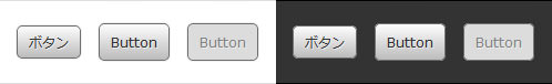
CSS3 Buttons Without Any Images
button要素を角丸ボタンに
2010/12/31
CSS3 Buttons Without Any Images
CSS3の「border-radius」+「box-shadow」プロパティを使用してbutton要素を角丸ボタンにする方法が紹介されています。 通常時、アクティブ時(フォーカス時)、無効化時の大きく3つの擬似要素クラス毎にスタイルを切り替えています。 button要素以外にも、同じ容量でa要素に指定することもできます。その場合は、:visitedも追加しておけばOKです。
[[指定方法]]
a要素、input要素、button要素にクラス名(button)を指定します。
inputあるいはbutton要素を無効化ボタンにする場合は、disabled属性を指定します。
<a href='#' class='button'>ボタン</a>
<input type='button' class='button' value='Input Button' />
<input type='button' class='button' value='Input Button' disabled='disabled' />
<button class='button'>Button</button>
<button class='button' disabled='disabled'>Button</button>
 Chrome
 Safari
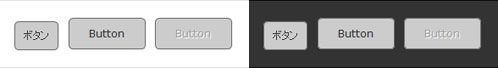 IE:PIE.htc使用時
※CSS3 PIEを使用すれば、IE6~8などCSS3に対応していないブラウザでもCSS3が使えます。
<h4>参考:<a href='http://naioo.com/blog/css3-buttons-without-any-images/' target='_blank'>CSS3 Buttons Without Any Images</a></h4>
<style type="text/css">
#dark {
    background-color:#333;
    border:1px solid #000;
    margin:20px auto; padding:20px;
    color:#fff;
}
#light{
    background-color:#fff;
    border:1px solid #dedede;
    margin:20px auto; padding:20px;
}
.button,
.button:visited {
    position:relative;
    color:#333!important;
    text-shadow:1px 1px 0px #eaeaea;
    margin:0; padding:7px 10px;
    border:1px solid #6e6e6e;
    text-decoration:none;
    background:#ccc;
    background:-webkit-gradient(linear,0% 0%,0% 100%,from(#fcfcfc),to(#bbbbbb));
    background:-moz-linear-gradient(top,#bbbbbb,#fcfcfc);
    -moz-border-radius:5px;
    -webkit-border-radius:5px;
    border-radius:5px;
    -moz-box-shadow:0px 0px 2px #ccc;
    -webkit-box-shadow:0px 0px 2px #ccc;
    box-shadow:0px 0px 2px #ccc;
    behavior:url(pie/PIE.htc);
}
.button:hover {
    background:#eee;
}
.button:active, .button:focus {
    background:#eee;
    background:-webkit-gradient(linear,0% 100%,0% 0%,from(#bbbbbb),to(#fcfcfc));
    background:-moz-linear-gradient(bottom,#bbbbbb,#fcfcfc);
}
.button:disabled {
    color:#848484!important;
    text-shadow:1px 1px 0px #eaeaea;
    background:#dcdcdc;
}
#dark .button {
    -moz-box-shadow:0px 0px 2px #333;
    -webkit-box-shadow:0px 0px 2px #333;
    box-shadow:0px 0px 2px #333;
    behavior:url(pie/PIE.htc);
}
</style>
<div id="light">
    <a href="#" class="button">ボタン</a>
    <input type="button" class="button" value="Input Button" />
    <input type="button" class="button" value="Input Button" disabled="disabled" />
    <button class="button">Button</button>
    <button class="button" disabled="disabled">Button</button>
</div>
<div id="dark">
    <a href="#" class="button">ボタン</a>
    <input type="button" class="button" value="Input Button" />
    <input type="button" class="button" value="Input Button" disabled="disabled" />
    <button class="button">Button</button>
    <button class="button" disabled="disabled">Button</button>
</div>
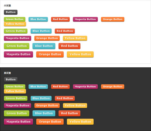
Super Awesome Buttons with CSS3 and RGBA
角丸ボタン
2010/12/31
Super Awesome Buttons with CSS3 and RGBA
CSSのクラス名を変えるだけで簡単にボタンの色を変えられるボタンを作成する方法が紹介されています。 ボタンにツヤ感を出すために画像(alert-overlay.png)が使われていますがなくてもいけます。
角丸部分はCSS3の「border-radius」プロパティ、影部分はCSS3の「box-shadow」プロパティが使用されています。
ボタンテキストの文字サイズは、「small」「midium」「large」の3パターン用意されています。 これもCSSのクラス名を追加するだけでOK。 色やサイズのバリエーションを増やせば好きなボタンを簡単に作れますね。
[[指定方法]]
a要素、input要素、button要素に「awesome」クラスを指定します。
さらに、色を変更する場合は「green|red|...」クラス、
フォントサイズを調整する場合は「small|midium|large」クラスを半角スペース区切りで指定します。
<a class='large awesome magenta'>Magenta Button</a>
<input type='button' class='small awesome green' value='Input Button' />
<button class='midium awesome blue'>Button</button>
 設置イメージ
※CSS3 PIEを使用すれば、IE6などCSS3に対応していないブラウザでもCSS3が使えます。
<script src="https://ajax.googleapis.com/ajax/libs/jquery/1.2.6/jquery.min.js"></script>
<h4>参照:<a href='http://www.zurb.com/article/266/super-awesome-buttons-with-css3-and-rgba' target='_blank'>Super Awesome Buttons with CSS3 and RGBA</a></h4>
<style type="text/css">
#dark {
    background-color:#333;
    border:1px solid #000;
    margin:20px auto; padding:20px;
    color:#fff;
}
#light{
    background-color:#fff;
    border:1px solid #dedede;
    margin:20px auto; padding:20px;
}
.awesome, .awesome:visited {
    border:0;
    background: #222 url(/content/img/css/alert-overlay.png) repeat-x;
    display: inline-block;
    margin:0; padding: 5px 10px 6px;
    vertical-align:middle;
    line-height:1;
    color: #fff;
    text-decoration: none;
    -moz-border-radius: 5px;
    -webkit-border-radius: 5px;
    -moz-box-shadow: 0 1px 3px rgba(0,0,0,0.5);
    -webkit-box-shadow: 0 1px 3px rgba(0,0,0,0.5);
    text-shadow: 0 -1px 1px rgba(0,0,0,0.25);
    border-bottom: 1px solid rgba(0,0,0,0.25);
    position: relative;
    cursor: pointer;
}

.awesome:hover                            { background-color: #111; color: #fff; }
.awesome:active                            { top: 1px; }

.small.awesome, .small.awesome:visited             { font-size: 11px; padding: ; }
.awesome, .awesome:visited,
.medium.awesome, .medium.awesome:visited         { font-size: 13px; font-weight: bold; line-height: 1; text-shadow: 0 -1px 1px rgba(0,0,0,0.25); }
.large.awesome, .large.awesome:visited             { font-size: 14px; padding: 8px 14px 9px; }

.green.awesome, .green.awesome:visited        { background-color: #91bd09; }
.green.awesome:hover                        { background-color: #749a02; }
.blue.awesome, .blue.awesome:visited        { background-color: #2daebf; }
.blue.awesome:hover                            { background-color: #007d9a; }
.red.awesome, .red.awesome:visited            { background-color: #e33100; }
.red.awesome:hover                            { background-color: #872300; }
.magenta.awesome, .magenta.awesome:visited        { background-color: #a9014b; }
.magenta.awesome:hover                            { background-color: #630030; }
.orange.awesome, .orange.awesome:visited        { background-color: #ff5c00; }
.orange.awesome:hover                            { background-color: #d45500; }
.yellow.awesome, .yellow.awesome:visited        { background-color: #ffb515; }
.yellow.awesome:hover                            { background-color: #fc9200; }
</style>

<div id="light">
    <p>白背景</p>
    <p><a class="awesome">Button</a></p>
    <p>
        <a class="small awesome green">Green Button</a>
        <a class="small awesome blue">Blue Button</a>
        <a class="small awesome red">Red Button</a>
        <a class="small awesome magenta">Magenta Button</a>
        <a class="small awesome orange">Orange Button</a>
        <a class="small awesome yellow">Yellow Button</a>
    </p>
    <p>
        <a class="midium awesome green">Green Button</a>
        <a class="midium awesome blue">Blue Button</a>
        <a class="midium awesome red">Red Button</a>
    </p>
    <p>
        <a class="midium awesome magenta">Magenta Button</a>
        <a class="midium awesome orange">Orange Button</a>
        <a class="midium awesome yellow">Yellow Button</a>
    </p>
    <p>
        <a class="large awesome green">Green Button</a>
        <a class="large awesome blue">Blue Button</a>
        <a class="large awesome red">Red Button</a>
    </p>
    <p>
        <a class="large awesome magenta">Magenta Button</a>
        <a class="large awesome orange">Orange Button</a>
        <a class="large awesome yellow">Yellow Button</a>
    </p>
    <p>
        <input type="button" class="small awesome green" value="Input Button" />
        <input type="button" class="midium awesome blue" value="Input Button" />
        <input type="button" class="large awesome red" value="Input Button" />
    </p>
    <p>
        <button class="small awesome green">Button</button>
        <button class="midium awesome blue">Button</button>
        <button class="large awesome red">Button</button>
    </p>
</div>

<div id="dark">
    <p>黒背景</p>
    <p><a class="awesome">Button</a></p>
    <p>
        <a class="small awesome green">Green Button</a>
        <a class="small awesome blue">Blue Button</a>
        <a class="small awesome red">Red Button</a>
        <a class="small awesome magenta">Magenta Button</a>
        <a class="small awesome orange">Orange Button</a>
        <a class="small awesome yellow">Yellow Button</a>
    </p>
    <p>
        <a class="midium awesome green">Green Button</a>
        <a class="midium awesome blue">Blue Button</a>
        <a class="midium awesome red">Red Button</a>
    </p>
    <p>
        <a class="midium awesome magenta">Magenta Button</a>
        <a class="midium awesome orange">Orange Button</a>
        <a class="midium awesome yellow">Yellow Button</a>
    </p>
    <p>
        <a class="large awesome green">Green Button</a>
        <a class="large awesome blue">Blue Button</a>
        <a class="large awesome red">Red Button</a>
    </p>
    <p>
        <a class="large awesome magenta">Magenta Button</a>
        <a class="large awesome orange">Orange Button</a>
        <a class="large awesome yellow">Yellow Button</a>
    </p>
    <p>
        <input type="button" class="small awesome green" value="Input Button" />
        <input type="button" class="midium awesome blue" value="Input Button" />
        <input type="button" class="large awesome red" value="Input Button" />
    </p>
    <p>
        <button class="small awesome green">Button</button>
        <button class="midium awesome blue">Button</button>
        <button class="large awesome red">Button</button>
    </p>
</div>
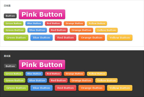
Nice CSS3 buttons
背景色が変えられるボタン
2010/12/31
Nice CSS3 buttons
上記と同じく、CSSのクラス名を変えるだけで簡単にボタンの色を変えられるボタンを作成する方法が掲載されています。 ボタンにツヤ感を出すために画像(overlay.png)が使われていますがなくてもいけます。
角丸部分はCSS3の「border-radius」プロパティ、影部分はCSS3の「box-shadow」プロパティが使用されています。
ボタンテキストの文字サイズは、「small」「midium」「large」「super」の4パターン用意されています。これもCSSのクラス名を追加するだけでOK。 色やサイズのバリエーションを増やせば好きなボタンを簡単に作れます。
[[指定方法]]
a要素、input要素、button要素に「button」クラスを指定します。
さらに、色を変更する場合は「green|red|...」クラス、
フォントサイズを調整する場合は「small|midium|large|super」クラスを半角スペース区切りで指定します。
<a class='large button green'>Green Button</a>
<input type='button' class='midium button blue' value='Input Button' />
<button class='large button pink'>Button</button>
 設置イメージ
※CSS3 PIEを使用すれば、IE6~8などCSS3に対応していないブラウザでもCSS3が使えます。
<h4>参照:<a href='http://www.htmldrive.net/items/show/795/Nice-CSS3-buttons.html' target='_blank'>Nice CSS3 buttons</a></h4>
<style type="text/css">
#dark {
    background-color:#333;
    border:1px solid #000;
    margin:20px auto; padding:20px;
    color:#fff;
}
#light{
    background-color:#fff;
    border:1px solid #dedede;
    margin:20px auto; padding:20px;
}
.button, .button:visited {
    border:0;
    background:#222 url(/content/img/css/overlay.png) repeat-x;
    display:inline-block;
    padding:5px 10px 6px;
    color:#fff;
    text-decoration:none;
    -moz-border-radius:6px;
    -webkit-border-radius:6px;
    -moz-box-shadow:0 1px 3px rgba(0,0,0,0.6);
    -webkit-box-shadow:0 1px 3px rgba(0,0,0,0.6);
    text-shadow:0 -1px 1px rgba(0,0,0,0.25);
    border-bottom:1px solid rgba(0,0,0,0.25);
    position:relative;
    cursor:pointer
}
.button:hover                            { background-color:#111; color:#fff; }
.button:active                            { top:1px; }
.small.button, .small.button:visited             { font-size:11px}
.button, .button:visited,
.medium.button, .medium.button:visited         { font-size:13px;
    font-weight:bold;
    line-height:1;
    text-shadow:0 -1px 1px rgba(0,0,0,0.25);
}

.large.button, .large.button:visited {
    font-size:14px;
    padding:8px 14px 9px;
}

.super.button, .super.button:visited {
    font-size:34px;
    padding:8px 14px 9px;
}
.pink.button, .magenta.button:visited        { background-color:#e22092; }
.pink.button:hover                            { background-color:#c81e82; }
.green.button, .green.button:visited        { background-color:#91bd09; }
.green.button:hover                            { background-color:#749a02; }
.red.button, .red.button:visited            { background-color:#e62727; }
.red.button:hover                            { background-color:#cf2525; }
.orange.button, .orange.button:visited        { background-color:#ff5c00; }
.orange.button:hover                        { background-color:#d45500; }
.blue.button, .blue.button:visited            { background-color:#2981e4; }
.blue.button:hover                            { background-color:#2575cf; }
.yellow.button, .yellow.button:visited        { background-color:#ffb515; }
.yellow.button:hover                        { background-color:#fc9200; }
</style>

<div id="light">
    <p>白背景</p>
    <p><a class="button">Button</a> <a class="super button pink">Pink Button</a></p>
    <p><a class="small button green">Green Button</a> <a class="small button blue">Blue Button</a> <a class="small button red">Red Button</a> <a class="small button orange">Orange Button</a> <a class="small button yellow">Yellow Button</a></p>
    <p><a class="midium button green">Green Button</a> <a class="midium button blue">Blue Button</a> <a class="midium button red">Red Button</a> <a class="midium button orange">Orange Button</a> <a class="midium button yellow">Yellow Button</a></p>
    <p><a class="large button green">Green Button</a> <a class="large button blue">Blue Button</a> <a class="large button red">Red Button</a> <a class="large button orange">Orange Button</a> <a class="large button yellow">Yellow Button</a></p>
    <p>
        <input type="button" class="small button green" value="Input Button" />
        <input type="button" class="midium button blue" value="Input Button" />
        <input type="button" class="large button red" value="Input Button" />
    </p>
    <p>
        <button class="small button orange">Button</button>
        <button class="midium button yellow">Button</button>
        <button class="large button pink">Button</button>
    </p>
</div>

<div id="dark">
    <p>黒背景</p>
    <p><a class="button">Button</a> <a class="super button pink">Pink Button</a></p>
    <p><a class="small button green">Green Button</a> <a class="small button blue">Blue Button</a> <a class="small button red">Red Button</a> <a class="small button orange">Orange Button</a> <a class="small button yellow">Yellow Button</a></p>
    <p><a class="midium button green">Green Button</a> <a class="midium button blue">Blue Button</a> <a class="midium button red">Red Button</a> <a class="midium button orange">Orange Button</a> <a class="midium button yellow">Yellow Button</a></p>
    <p><a class="large button green">Green Button</a> <a class="large button blue">Blue Button</a> <a class="large button red">Red Button</a> <a class="large button orange">Orange Button</a> <a class="large button yellow">Yellow Button</a></p>
    <p>
        <input type="button" class="small button green" value="Input Button" />
        <input type="button" class="midium button blue" value="Input Button" />
        <input type="button" class="large button red" value="Input Button" />
    </p>
    <p>
        <button class="small button orange">Button</button>
        <button class="midium button yellow">Button</button>
        <button class="large button pink">Button</button>
    </p>
</div>
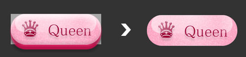
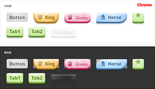
lovely Candy CSS3 buttons
ラムネ菓子みたいな可愛いボタン
2010/12/31
lovely Candy CSS3 buttons
ラムネ菓子みたいな可愛いボタンを作成する方法が掲載されています。
ノイズ模様は画像(noise.png)が使用されています。
CSS名を複数指定していくことで形や色を簡単にカスタマイズできます。
[[指定方法]]
a要素、input要素、button要素に「button」クラスを指定します。
グロッシー効果(glossy)、グラフ効果(glass)、角丸などのシェイプ方法(Shape)、アイコンだけかの有無なドを指定する場合は、半角スペース区切りで指定します。
<a href='#' data-icon='♞' class='button blue skew'>Horse</a>
<input type='button' class='button pink glossy' value='Input Button' />
<input type='button' disabled='disabled' class='button pink glossy' value='Input Button - Disabled' />
<button class='button pink glossy'>Button</button>
<button disabled='disabled' class='button pink glossy'>Button - Disabled</button>
※Safariだときれいに見えますが、Chromeだと「-webkit-box-shadow」プロパティのインナーシャドウがうまく効かず、下図のように角丸部分の上に四角い画像が乗ったように見えてしまうのでインナーシャドウを取るかinsetの指定を外したほうがよいみたいです。 立体感がなくなりますが・・・
-webkit-box-shadow:
 inset rgba(255,254,255,0.6) 0 0.3em .3em,
 inset rgba(0,0,0,0.15) 0 -0.1em .3em, /* inner shadow */
 hsl(39, 100%, 40%) 0 .1em 3px, hsl(39, 100%, 30%) 0 .3em 1px, /* color border */
 rgba(0,0,0,0.2) 0 .5em 5px;/* drop shadow */
 Chrome
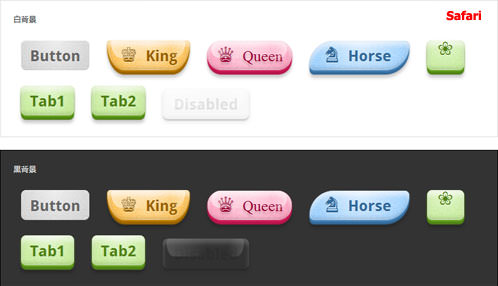 Safari
<h4>参照:<a href='http://www.htmldrive.net/items/show/793/lovely-Candy-CSS3-buttons.html' target='_blank'>lovely Candy CSS3 buttons</a></h4>
<style type="text/css">
#dark {
    background-color:#333;
    border:1px solid #000;
    margin:20px auto;padding:20px;
    color:#fff;
}
#light{
    background-color:#fff;
    border:1px solid #dedede;
    margin:20px auto;padding:20px;
}


/* BonBon Buttons 1.1 by simurai.com

1.1 Added unprefixed attributes, :focus style, <button> support
1.0 Released

Usage:

    Default button:             <a href="" class="button">Label</a>
    More fancy with icon:         <a href="" class="button orange glossy" data-icon="★">Label</a>

Following additional class names are supported:

    Color:         orange, pink, blue, green, transparent
    Font:         serif
    Material:     glossy, glass
    Size:         xs, xl
    Shape:         round, oval, brackets, skew, back, knife, shield, drop, morph
    Icon only:     icon
    Disabled:    disabled

*/


/* -------------- THE button -------------- */
.button {
/* text */
    text-decoration:         none;
    font:                     24px/1em 'Droid Sans', sans-serif;
    font-weight:             bold;
    text-shadow:             rgba(255,255,255,.5) 0 1px 0;
    -webkit-user-select:     none;
    -moz-user-select:         none;
    user-select:             none;


/* layout */
    padding:                 .5em .6em .4em .6em;
    margin:                 .5em;
    display:                 inline-block;
    position:                 relative;

    -webkit-border-radius:     8px;
    -moz-border-radius:     8px;
    border-radius:     8px;

/* effects */
    border-top:         1px solid rgba(255,255,255,0.8);
    border-bottom:         1px solid rgba(0,0,0,0.1);

    background-image:     -webkit-gradient(radial, 50% 0, 100, 50% 0, 0, from( rgba(255,255,255,0) ), to( rgba(255,255,255,0.7) )), url(/content/img/css/noise.png);
    background-image:     -moz-radial-gradient(top, ellipse cover, rgba(255,255,255,0.7) 0%, rgba(255,255,255,0) 100%), url(/content/img/css/noise.png);
    background-image:     gradient(radial, 50% 0, 100, 50% 0, 0, from( rgba(255,255,255,0) ), to( rgba(255,255,255,0.7) )), url(/content/img/css/noise.png);
    -webkit-transition: background .2s ease-in-out;
    -moz-transition:     background .2s ease-in-out;
    transition:         background .2s ease-in-out;

/* color */
    color:                 hsl(0, 0%, 40%) !important;
    background-color:     hsl(0, 0%, 75%);

    -webkit-box-shadow: inset rgba(255,254,255,0.6) 0 0.3em .3em, inset rgba(0,0,0,0.15), /* inner shadow */
                        hsl(0, 0%, 60%) 0 .1em 3px, hsl(0, 0%, 45%) 0 .3em 1px, /* color border */
                        rgba(0,0,0,0.2) 0 .5em 5px;/* drop shadow */
    -moz-box-shadow:     inset rgba(255,254,255,0.6) 0 0.3em .3em, inset rgba(0,0,0,0.15) 0 -0.1em .3em, /* inner shadow */
                        hsl(0, 0%, 60%) 0 .1em 3px, hsl(0, 0%, 45%) 0 .3em 1px, /* color border */
                        rgba(0,0,0,0.2) 0 .5em 5px;/* drop shadow */
    box-shadow:             inset rgba(255,254,255,0.6) 0 0.3em .3em, inset rgba(0,0,0,0.15) 0 -0.1em .3em, /* inner shadow */
                        hsl(0, 0%, 60%) 0 .1em 3px, hsl(0, 0%, 45%) 0 .3em 1px, /* color border */
                        rgba(0,0,0,0.2) 0 .5em 5px;/* drop shadow */
}
/* -------------- button (tag) -------------- */
button.button {
    border-left: none;
    border-right: none;
}
button.button:hover {
    cursor: pointer;
}
/* -------------- icon -------------- */
.button:before {
    font:             1.2em/0 'Pictos', sans-serif;
    content:         attr(data-icon);/* gets the icon value from the custom data attribute and puts it infront of the button label */
    margin-right:     0.4em;


}
/* icon only */
.icon {
    font-weight: normal;
    font-style: normal;
    text-indent:     -999em;
}
.icon:before {
    margin-right:     0;
    display:         block;
    height:         0;
    text-indent:     0px;
}
/* -------------- colours -------------- */
.button.orange {
    color:                 hsl(39, 100%, 30%) !important;
    background-color:     hsl(39, 100%, 50%);
    -webkit-box-shadow: inset rgba(255,254,255,0.6) 0 0.3em .3em, inset rgba(0,0,0,0.15) 0 -0.1em .3em, /* inner shadow */
                            hsl(39, 100%, 40%) 0 .1em 3px, hsl(39, 100%, 30%) 0 .3em 1px, /* color border */
                            rgba(0,0,0,0.2) 0 .5em 5px;/* drop shadow */
    -moz-box-shadow:     inset rgba(255,254,255,0.6) 0 0.3em .3em, inset rgba(0,0,0,0.15) 0 -0.1em .3em, /* inner shadow */
                            hsl(39, 100%, 40%) 0 .1em 3px, hsl(39, 100%, 30%) 0 .3em 1px, /* color border */
                            rgba(0,0,0,0.2) 0 .5em 5px;/* drop shadow */
    box-shadow:             inset rgba(255,254,255,0.6) 0 0.3em .3em, inset rgba(0,0,0,0.15) 0 -0.1em .3em, /* inner shadow */
                            hsl(39, 100%, 40%) 0 .1em 3px, hsl(39, 100%, 30%) 0 .3em 1px, /* color border */
                            rgba(0,0,0,0.2) 0 .5em 5px;/* drop shadow */
}
.button.orange:hover {     background-color: hsl(39, 100%, 65%);}
.button.blue {
    color:                 hsl(208, 50%, 40%) !important;
    background-color:     hsl(208, 100%, 75%);

    -webkit-box-shadow: inset rgba(255,254,255,0.6) 0 0.3em .3em, inset rgba(0,0,0,0.15) 0 -0.1em .3em, /* inner shadow */
                            hsl(208, 50%, 55%) 0 .1em 3px, hsl(208, 50%, 40%) 0 .3em 1px, /* color border */
                            rgba(0,0,0,0.2) 0 .5em 5px;    /* drop shadow */
    -moz-box-shadow:     inset rgba(255,254,255,0.6) 0 0.3em .3em, inset rgba(0,0,0,0.15) 0 -0.1em .3em, /* inner shadow */
                            hsl(208, 50%, 55%) 0 .1em 3px, hsl(208, 50%, 40%) 0 .3em 1px, /* color border */
                            rgba(0,0,0,0.2) 0 .5em 5px;    /* drop shadow */
    box-shadow:         inset rgba(255,254,255,0.6) 0 0.3em .3em, inset rgba(0,0,0,0.15) 0 -0.1em .3em, /* inner shadow */
                            hsl(208, 50%, 55%) 0 .1em 3px, hsl(208, 50%, 40%) 0 .3em 1px, /* color border */
                            rgba(0,0,0,0.2) 0 .5em 5px;    /* drop shadow */
}
.button.blue:hover {     background-color: hsl(208, 100%, 83%);}
.button.green {
    color:                 hsl(88, 70%, 30%) !important;
    background-color:     hsl(88, 70%, 60%);
    -webkit-box-shadow: inset rgba(255,254,255,0.6) 0 0.3em .3em, inset rgba(0,0,0,0.15) 0 -0.1em .3em, /* inner shadow */
                            hsl(88, 70%, 40%) 0 .1em 3px, hsl(88, 70%, 30%) 0 .3em 1px, /* color border */
                            rgba(0,0,0,0.2) 0 .5em 5px;/* drop shadow */
    -moz-box-shadow:     inset rgba(255,254,255,0.6) 0 0.3em .3em, inset rgba(0,0,0,0.15) 0 -0.1em .3em, /* inner shadow */
                            hsl(88, 70%, 40%) 0 .1em 3px, hsl(88, 70%, 30%) 0 .3em 1px, /* color border */
                            rgba(0,0,0,0.2) 0 .5em 5px;/* drop shadow */
    box-shadow:             inset rgba(255,254,255,0.6) 0 0.3em .3em, inset rgba(0,0,0,0.15) 0 -0.1em .3em, /* inner shadow */
                            hsl(88, 70%, 40%) 0 .1em 3px, hsl(88, 70%, 30%) 0 .3em 1px, /* color border */
                            rgba(0,0,0,0.2) 0 .5em 5px;/* drop shadow */
}
.button.green:hover {     background-color: hsl(88, 70%, 75%);}
.button.pink {
    color:                 hsl(340, 100%, 30%) !important;
    background-color:     hsl(340, 100%, 75%);
    -webkit-box-shadow: inset rgba(255,254,255,0.6) 0 0.3em .3em, inset rgba(0,0,0,0.15) 0 -0.1em .3em, /* inner shadow */
                            hsl(340, 70%, 50%) 0 .1em 3px, hsl(340, 80%, 40%) 0 .3em 1px, /* color border */
                            rgba(0,0,0,0.2) 0 .5em 5px;/* drop shadow */
    -moz-box-shadow:     inset rgba(255,254,255,0.6) 0 0.3em .3em, inset rgba(0,0,0,0.15) 0 -0.1em .3em, /* inner shadow */
                            hsl(340, 70%, 50%) 0 .1em 3px, hsl(340, 80%, 40%) 0 .3em 1px, /* color border */
                            rgba(0,0,0,0.2) 0 .5em 5px;/* drop shadow */
    box-shadow:         inset rgba(255,254,255,0.6) 0 0.3em .3em, inset rgba(0,0,0,0.15) 0 -0.1em .3em, /* inner shadow */
                            hsl(340, 70%, 50%) 0 .1em 3px, hsl(340, 80%, 40%) 0 .3em 1px, /* color border */
                            rgba(0,0,0,0.2) 0 .5em 5px;/* drop shadow */
}
.button.pink:hover {     background-color: hsl(340, 100%, 83%);}
.button.transparent {
    color:     rgba(0,0,0,0.5) !important;
}
.button.transparent, .button.transparent:hover, .button.transparent:active {
    background-color: transparent;
    background-image: none;
}
.button.transparent:hover {
    opacity: .9;
}
/* -------------- States -------------- */
.button:hover {
    background-color:     hsl(0, 0%, 83%);
}
.button:active {
    background-image:     -webkit-gradient(radial, 50% 0, 100, 50% 0, 0, from( rgba(255,255,255,0) ), to( rgba(255,255,255,0) )), url(noise.png);
    background-image:     -moz-gradient(radial, 50% 0, 100, 50% 0, 0, from( rgba(255,255,255,0) ), to( rgba(255,255,255,0) )), url(noise.png);
    background-image:     gradient(radial, 50% 0, 100, 50% 0, 0, from( rgba(255,255,255,0) ), to( rgba(255,255,255,0) )), url(noise.png);
    -webkit-box-shadow: inset rgba(255,255,255,0.6) 0 0.3em .3em, inset rgba(0,0,0,0.2) 0 -0.1em .3em, /* inner shadow */
                            rgba(0,0,0,0.4) 0 .1em 1px, /* border */
                            rgba(0,0,0,0.2) 0 .2em 6px;/* drop shadow */
    -moz-box-shadow:     inset rgba(255,255,255,0.6) 0 0.3em .3em, inset rgba(0,0,0,0.2) 0 -0.1em .3em, /* inner shadow */
                            rgba(0,0,0,0.4) 0 .1em 1px, /* border */
                            rgba(0,0,0,0.2) 0 .2em 6px;/* drop shadow */
    box-shadow:         inset rgba(255,255,255,0.6) 0 0.3em .3em, inset rgba(0,0,0,0.2) 0 -0.1em .3em, /* inner shadow */
                            rgba(0,0,0,0.4) 0 .1em 1px, /* border */
                            rgba(0,0,0,0.2) 0 .2em 6px;/* drop shadow */
    -webkit-transform:     translateY(.2em);
    -moz-transform:     translateY(.2em);
    transform:             translateY(.2em);
}
.button:focus {
    outline: none;
    color: rgba(254,255,255,0.9) !important;
    text-shadow: rgba(0,0,0,0.2) 0 1px 2px;
}
.button[disabled], .button[disabled]:hover, .button.disabled, .button.disabled:hover {
    opacity:             .5;
    cursor:             default;
    color:                 rgba(0,0,0,0.2) !important;
    text-shadow:         none !important;
    background-color:     rgba(0,0,0,0.05);
    background-image:     none;
    border-top:         none;
    -webkit-box-shadow: inset rgba(255,254,255,0.4) 0 0.3em .3em, inset rgba(0,0,0,0.1) 0 -0.1em .3em, /* inner shadow */
                            rgba(0,0,0,0.3) 0 .1em 1px, /* border */
                            rgba(0,0,0,0.2) 0 .2em 6px;/* drop shadow */
    -moz-box-shadow:     inset rgba(255,254,255,0.4) 0 0.3em .3em, inset rgba(0,0,0,0.1) 0 -0.1em .3em, /* inner shadow */
                            rgba(0,0,0,0.3) 0 .1em 1px, /* border */
                            rgba(0,0,0,0.2) 0 .2em 6px;/* drop shadow */
    box-shadow:         inset rgba(255,254,255,0.4) 0 0.3em .3em, inset rgba(0,0,0,0.1) 0 -0.1em .3em, /* inner shadow */
                            rgba(0,0,0,0.3) 0 .1em 1px, /* border */
                            rgba(0,0,0,0.2) 0 .2em 6px;/* drop shadow */
    -webkit-transform:     translateY(5px);
    -moz-transform:     translateY(5px);
    transform:             translateY(5px);
}
/* -------------- Fonts -------------- */
.serif {
    font-family: 'Lobster', serif;
    font-weight:             normal;
}
/* -------------- Sizes -------------- */
.xs { font-size: 16px;}
.xl { font-size: 32px;}
/* -------------- Materials -------------- */
.button.glossy:after, .button.glass:after {
    content:     "";
    position:     absolute;
    width:         90%;
    height:     60%;
    top:         0;
    left:         5%;

    -webkit-border-radius:     .5em .5em 1em 1em / .5em .5em 2em 2em;
    -moz-border-radius:     .5em .5em 1em 1em / .5em .5em 2em 2em;
    border-radius:             .5em .5em 1em 1em / .5em .5em 2em 2em;

    background-image:         -webkit-gradient(linear, 0% 0, 100% 0, from( rgba(255,255,255,.55) ), to( rgba(255,255,255,.5) ),
                                color-stop(.5, rgba(255,255,255,0)), color-stop(.8, rgba(255,255,255,0)) );
    background-image:         -moz-linear-gradient(left, rgba(255,255,255,.55), rgba(255,255,255,0) 50%, rgba(255,255,255,0) 80%, rgba(255,255,255,.5) );
    background-image:         gradient(linear, 0% 0, 100% 0, from( rgba(255,255,255,.55) ), to( rgba(255,255,255,.5) ),
                                color-stop(.5, rgba(255,255,255,0)), color-stop(.8, rgba(255,255,255,0)) );
}
.button.glossy:active:after,
.button.glass:active:after,
.button.disabled:after,
.button[disabled]:after
 { opacity: .6;}
.button.icon.glossy:after,
.button.icon.glass:after { height: 75% ;}
/* -------------- Glass + Transparent -------------- */
.button.glass {
    text-shadow: rgba(255,255,255,.5) 0 -1px 0, rgba(0,0,0,0.18) 0 .18em .15em;
}
.button.glass:active {
    text-shadow: rgba(255,255,255,.3) 0 1px 0, rgba(0,0,0,0.15) 0 .18em .15em;
}
/* -------------- Shapes -------------- */
/* round */
.round, .round.glossy:after, .round.glass:after {
    border-top: none;
    -webkit-border-radius:     1em;
    -moz-border-radius:     1em;
    border-radius:             1em;
}
/* oval */
.oval {
    border-top:             none;
    padding-left:             .8em;
    padding-right:             .8em;
    -webkit-border-radius:     5em / 2em;
    -moz-border-radius:     5em / 2em;
    border-radius:             5em / 2em;
}
.oval.glossy:after, .oval.glass:after {
    top:                     5%;
    -webkit-border-radius:     5em / 2em 2em 1em 1em;
    -moz-border-radius:     5em / 2em 2em 1em 1em;
    border-radius:             5em / 2em 2em 1em 1em;
}
.oval.icon {
    padding-left:             .8em;
    padding-right:             .8em;
    -webkit-border-radius:     1.5em / 1em;
    -moz-border-radius:     1.5em / 1em;
    border-radius:             1.5em / 1em;
}
.oval.icon.glossy:after, .oval.icon.glass:after {
    -webkit-border-radius:     1.5em / 1em;
    -moz-border-radius:     1.5em / 1em;
    border-radius:             1.5em / 1em;
}
/* brackets */
.brackets, .brackets.glossy:after, .brackets.glass:after {
    border-top:             none;
    -webkit-border-radius:     .5em / 1em;
    -moz-border-radius:     .5em / 1em;
    border-radius:             .5em / 1em;
}
/* skew */
.skew {
    border-top:             none;
    padding-right:             1.2em;
    padding-left:             0.8em;
    -webkit-border-radius:     5em 1em / 5em 1em;
    -moz-border-radius:     5em 1em / 5em 1em;
    border-radius:             5em 1em / 5em 1em;
}
.skew.glossy:after, .skew.glass:after {
    left: 10%;
    -webkit-border-radius:     7em 1em / 5em 1em;
    -moz-border-radius:     7em 1em / 5em 1em;
    border-radius:             7em 1em / 5em 1em;
}
.skew.icon {
    padding-right:             .9em;
    padding-left:             .8em;
}
/* back */
.back, .back.glossy:after, .back.glass:after {
    border-top-color:         rgba(255,255,255,0.5);
    -webkit-border-radius:     1.6em 1.6em 1em 1em / 4em 4em 1em 1em;
    -moz-border-radius:     1.6em 1.6em 1em 1em / 4em 4em 1em 1em;
    border-radius:             1.6em 1.6em 1em 1em / 4em 4em 1em 1em;
}
.back.glossy:after, .back.glass:after {
     left:     6%;
     width:    88%;
}
/* knife */
.knife {
    padding-left: 1.5em;
    -webkit-border-radius:     .2em .5em .5em 8em / .2em .5em .5em 5em;
    -moz-border-radius:     .2em .5em .5em 8em / .2em .5em .5em 5em;
    border-radius:             .2em .5em .5em 8em / .2em .5em .5em 5em;
}
.knife.glossy:after, .knife.glass:after {
    left:                     3%;
    width:                     97%;
    -webkit-border-radius:     .1em .5em .5em 8em / .1em .5em .5em 2em;
    -moz-border-radius:     .1em .5em .5em 8em / .1em .5em .5em 2em;
    border-radius:             .1em .5em .5em 8em / .1em .5em .5em 2em;
}
.knife.glossy.icon:after, .knife.glass.icon:after {
    left:                     5%;
    width:                     95%;
    -webkit-border-radius:     .5em .5em 1em 6em / .5em .5em 1em 4em;
    -moz-border-radius:     .5em .5em 1em 6em / .5em .5em 1em 4em;
    border-radius:             .5em .5em 1em 6em / .5em .5em 1em 4em;
}
/* shield */
.shield, .shield.glossy:after, .shield.glass:after {
    -webkit-border-radius:     .4em .4em 2em 2em / .4em .4em 3em 3em;
    -moz-border-radius:     .4em .4em 2em 2em / .4em .4em 3em 3em;
    border-radius:             .4em .4em 2em 2em / .4em .4em 3em 3em;
}
.shield {
    padding-left:     .8em;
    padding-right:     .8em;
}
.shield.icon {
    padding-left:     .6em;
    padding-right:     .6em;
}
/* drop */
.drop {
    border-top: none;
    -webkit-border-radius:     2em 5em  2em .6em / 2em 4em 2em .6em;
    -moz-border-radius:     2em 5em  2em .6em / 2em 4em 2em .6em;
    border-radius:             2em 5em  2em .6em / 2em 4em 2em .6em;
}
.drop.glossy:after, .drop.glass:after {
    left: 4%;
    -webkit-border-radius:     2em 6em  2em 1em / 2em 4em 2em 2em;
    -moz-border-radius:     2em 6em  2em 1em / 2em 4em 2em 2em;
    border-radius:             2em 6em  2em 1em / 2em 4em 2em 2em;
}
.drop.icon {
    padding-right: .6em;
}
/* morph */
.morph {
    border-top: none;
    -webkit-border-radius:     5em / 2em;
    -moz-border-radius:     5em / 2em;
    border-radius:             5em / 2em;
    -webkit-transition:     -webkit-border-radius .3s ease-in-out;
    -moz-transition:         -moz-border-radius .3s ease-in-out;
    transition:             -moz-border-radius .3s ease-in-out;
}
.morph:hover {
    -webkit-border-radius:     .4em .4em 2em 2em / .4em .4em 3em 3em;
    -moz-border-radius:     .4em .4em 2em 2em / .4em .4em 3em 3em;
    border-radius:             .4em .4em 2em 2em / .4em .4em 3em 3em;
}
.morph:active {
    -webkit-border-radius:     .3em;
    -moz-border-radius:     .3em;
    border-radius:             .3em;
}
.morph:after {
    display: none;
}
/* Some ugly hacks for FF.
Thanks to David Hund for some help - http://valuedstandards.com/static/test/buttons/ */
@-moz-document url-prefix() {
    .button { text-align: center;}
    .icon { padding: .5em 1em;}
    .icon:before { margin-left: -.42em;float: left;}

    .drop.icon { padding-right: 1.1em;}
    .shield.icon { padding-left: 1.1em;padding-right: 1.1em;}
    .skew.icon { padding-right: 1.4em;padding-left: 1.3em;}
    .oval.icon { padding-left: 1.3em;padding-right: 1.3em;    }
    .knife { padding-left: 2em;}
}
/* Damn, this became a fat baby..  */
</style>

<div id="light">
    <p>白背景</p>
        <a href="#" class="button">Button</a>
        <a href="#" data-icon="♚" class="button orange shield glossy">King</a>
        <a href="#" data-icon="♛" class="button pink serif round glass">Queen</a>
        <a href="#" data-icon="♞" class="button blue skew">Horse</a>
        <a href="#" data-icon="❀" class="button green icon">Flower</a>
        <br>
        <a href="#accessibility" role="button" tabindex="1" class="button green">Tab1</a>
        <a href="#accessibility" role="button" tabindex="2" class="button green">Tab2</a>
        <br>
        <input type="button" class="button pink glossy" value="Input Button" />
        <input type="button" disabled="disabled" class="button pink glossy" value="Input Button - Disabled" />
        <br>
        <button class="button pink glossy">Button</button>
        <button disabled="disabled" class="button pink glossy">Button - Disabled</button>
</div>

<div id="dark">
    <p>黒背景</p>
        <a href="#" class="button">Button</a>
        <a href="#" data-icon="♚" class="button orange shield glossy">King</a>
        <a href="#" data-icon="♛" class="button pink serif round glass">Queen</a>
        <a href="#" data-icon="♞" class="button blue skew">Horse</a>
        <a href="#" data-icon="❀" class="button green icon">Flower</a>
        <br>
        <a href="#accessibility" role="button" tabindex="1" class="button green">Tab1</a>
        <a href="#accessibility" role="button" tabindex="2" class="button green">Tab2</a>
        <br>
        <input type="button" class="button pink glossy" value="Input Button" />
        <input type="button" disabled="disabled" class="button pink glossy" value="Input Button - Disabled" />
        <br>
        <button class="button pink glossy">Button</button>
        <button disabled="disabled" class="button pink glossy">Button - Disabled</button>
</div>
Animated Bubble Buttons CSS3
マウスオーバーで背景の泡がアニメーションするシャンパンみたいなボタン
2010/12/31
Animated Bubble Buttons CSS3
マウスオーバーで泡がアニメーションするシャンパンみたいなボタンを作成する方法が掲載されています。 CSS3だとJavaScriptを使わずともアニメーションできるのがよいですね♪
背景画像にしかれている泡画像(button_bg.png)は、背景複数指定とアニメーション「transition」プロパティを使用してアニメーションしているように見せています。
黒など濃い背景の上にボタンを表示する場合は、buttonクラスのシャドーの色を背景に合わせて変更した方がよいです。
#dark .button{
	-moz-box-shadow:0 0 1px #fff inset; /* 黒なら→0 0 1px #000 inset */
	-webkit-box-shadow:0 0 1px #fff inset; /* 黒なら→0 0 1px #000 inset */
	box-shadow:0 0 1px #fff inset; /* 黒なら→0 0 1px #000 inset */
}
[[指定方法]]
a要素、input要素、button要素に「button」クラスを指定します。
さらに、色を変更する場合は「green|red|...」クラス、
フォントサイズを調整する場合は「small|midium|big」クラス、
楕円形にしたい場合は「rounded」クラスを半角スペース区切りで指定します。
<a href='#' class='button small green '>Green Button</a>
<a href='#' class='button medium green rounded'>Green Button Rounded</a>
<input type='button' class='button big green' value='Input Button' />
<button class='button small orange'>Button</button>
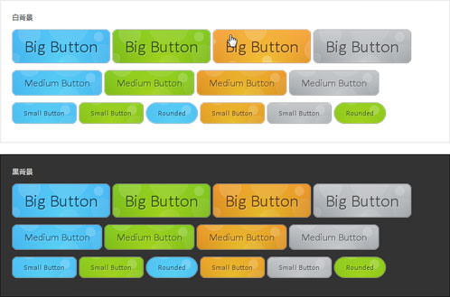 設置イメージ
<h4>参照:<a href='http://www.htmldrive.net/items/show/657/Animated-Bubble-Buttons-CSS3.html' target='_blank'>Animated Bubble Buttons CSS3</a></h4>
<style type="text/css">
#dark {
    background-color:#333;
    border:1px solid #000;
    margin:20px auto;padding:20px;
    color:#fff;
}
#light{
    background-color:#fff;
    border:1px solid #dedede;
    margin:20px auto;padding:20px;
}

.button{
    font:15px Calibri, Arial, sans-serif;
    /* A semi-transparent text shadow */
    text-shadow:1px 1px 0 rgba(255,255,255,0.4);

    /* Overriding the default underline styling of the links */
    text-decoration:none !important;
    white-space:nowrap;

    display:inline-block;
    vertical-align:baseline;
    position:relative;
    cursor:pointer;
    padding:10px 20px;

    background-repeat:no-repeat;
    /* The following two rules are fallbacks, in case
       the browser does not support multiple backgrounds. */
    background-position:bottom left;
    background-image:url(/content/img/css/button_bg.png);

    /* Multiple backgrounds version. The background images
       are defined individually in color classes */

    background-position:bottom left, top right, 0 0, 0 0;
    background-clip:border-box;

    /* Applying a default border raidus of 8px */

    -moz-border-radius:8px;
    -webkit-border-radius:8px;
    border-radius:8px;

    /* A 1px highlight inside of the button */

    -moz-box-shadow:0 0 1px #fff inset;
    -webkit-box-shadow:0 0 1px #fff inset;
    box-shadow:0 0 1px #fff inset;

    /* Animating the background positions with CSS3 */
    /* Currently works only in Safari/Chrome */

    -webkit-transition:background-position 1s;
    -moz-transition:background-position 1s;
    transition:background-position 1s;
}
#dark .button{
    -moz-box-shadow:0 0 1px #333 inset;
    -webkit-box-shadow:0 0 1px #333 inset;
    box-shadow:0 0 1px #333 inset;
}

.button:hover{

    /* The first rule is a fallback, in case the browser
       does not support multiple backgrounds
    */

    background-position:top left;
    background-position:top left, bottom right, 0 0, 0 0;
}
.button:active{
    /* Moving the button 1px to the bottom when clicked */
    bottom:-1px;
}
/* The three buttons sizes */
.button.big        { font-size:30px;}
.button.medium    { font-size:18px;}
.button.small    { font-size:13px;}
/* A more rounded button */
.button.rounded{
    -moz-border-radius:4em;
    -webkit-border-radius:4em;
    border-radius:4em;
}
/* Defining four button colors */
/* BlueButton */
.blue.button{
    color:#0f4b6d !important;

    border:1px solid #84acc3 !important;

    /* A fallback background color */
    background-color: #48b5f2;

    /* Specifying a version with gradients according to */

    background-image:    url(/content/img/css/button_bg.png), url(/content/img/css/button_bg.png),
                        -moz-radial-gradient(    center bottom, circle,
                                                rgba(89,208,244,1) 0,rgba(89,208,244,0) 100px),
                        -moz-linear-gradient(#4fbbf7, #3faeeb);
    background-image:    url(/content/img/css/button_bg.png), url(/content/img/css/button_bg.png),
                        -webkit-gradient(    radial, 50% 100%, 0, 50% 100%, 100,
                                            from(rgba(89,208,244,1)), to(rgba(89,208,244,0))),
                        -webkit-gradient(linear, 0% 0%, 0% 100%, from(#4fbbf7), to(#3faeeb));
}
.blue.button:hover{
    background-color:#63c7fe;

    background-image:    url(/content/img/css/button_bg.png), url(/content/img/css/button_bg.png),
                        -moz-radial-gradient(    center bottom, circle,
                                                rgba(109,217,250,1) 0,rgba(109,217,250,0) 100px),
                        -moz-linear-gradient(#63c7fe, #58bef7);

    background-image:    url(/content/img/css/button_bg.png), url(/content/img/css/button_bg.png),
                        -webkit-gradient(    radial, 50% 100%, 0, 50% 100%, 100,
                                            from(rgba(109,217,250,1)), to(rgba(109,217,250,0))),
                        -webkit-gradient(linear, 0% 0%, 0% 100%, from(#63c7fe), to(#58bef7));
}
/* Green Button */
.green.button{
    color:#345903 !important;
    border:1px solid #96a37b !important;
    background-color: #79be1e;

    background-image:url(/content/img/css/button_bg.png), url(/content/img/css/button_bg.png), -moz-radial-gradient(center bottom, circle, rgba(162,211,30,1) 0,rgba(162,211,30,0) 100px),-moz-linear-gradient(#82cc27, #74b317);
    background-image:url(/content/img/css/button_bg.png), url(/content/img/css/button_bg.png), -webkit-gradient(radial, 50% 100%, 0, 50% 100%, 100, from(rgba(162,211,30,1)), to(rgba(162,211,30,0))),-webkit-gradient(linear, 0% 0%, 0% 100%, from(#82cc27), to(#74b317));
}
.green.button:hover{
    background-color:#89d228;

    background-image:url(/content/img/css/button_bg.png), url(/content/img/css/button_bg.png), -moz-radial-gradient(center bottom, circle, rgba(183,229,45,1) 0,rgba(183,229,45,0) 100px),-moz-linear-gradient(#90de31, #7fc01e);
    background-image:url(/content/img/css/button_bg.png), url(/content/img/css/button_bg.png), -webkit-gradient(radial, 50% 100%, 0, 50% 100%, 100, from(rgba(183,229,45,1)), to(rgba(183,229,45,0))),-webkit-gradient(linear, 0% 0%, 0% 100%, from(#90de31), to(#7fc01e));
}
/* Orange Button */
.orange.button{
    color:#693e0a !important;
    border:1px solid #bea280 !important;
    background-color: #e38d27;

    background-image:url(/content/img/css/button_bg.png), url(/content/img/css/button_bg.png), -moz-radial-gradient(center bottom, circle, rgba(232,189,45,1) 0,rgba(232,189,45,0) 100px),-moz-linear-gradient(#f1982f, #d4821f);
    background-image:url(/content/img/css/button_bg.png), url(/content/img/css/button_bg.png), -webkit-gradient(radial, 50% 100%, 0, 50% 100%, 100, from(rgba(232,189,45,1)), to(rgba(232,189,45,0))),-webkit-gradient(linear, 0% 0%, 0% 100%, from(#f1982f), to(#d4821f));
}
.orange.button:hover{
    background-color:#ec9732;

    background-image:url(/content/img/css/button_bg.png), url(/content/img/css/button_bg.png), -moz-radial-gradient(center bottom, circle, rgba(241,192,52,1) 0,rgba(241,192,52,0) 100px),-moz-linear-gradient(#f9a746, #e18f2b);
    background-image:url(/content/img/css/button_bg.png), url(/content/img/css/button_bg.png), -webkit-gradient(radial, 50% 100%, 0, 50% 100%, 100, from(rgba(241,192,52,1)), to(rgba(241,192,52,0))),-webkit-gradient(linear, 0% 0%, 0% 100%, from(#f9a746), to(#e18f2b));
}
.gray.button{
    color:#525252 !important;
    border:1px solid #a5a5a5 !important;
    background-color: #a9adb1;

    background-image:url(/content/img/css/button_bg.png), url(/content/img/css/button_bg.png), -moz-radial-gradient(center bottom, circle, rgba(197,199,202,1) 0,rgba(197,199,202,0) 100px),-moz-linear-gradient(#c5c7ca, #92989c);
    background-image:url(/content/img/css/button_bg.png), url(/content/img/css/button_bg.png), -webkit-gradient(radial, 50% 100%, 0, 50% 100%, 100, from(rgba(197,199,202,1)), to(rgba(197,199,202,0))),-webkit-gradient(linear, 0% 0%, 0% 100%, from(#c5c7ca), to(#92989c));
}
.gray.button:hover{
    background-color:#b6bbc0;

    background-image:url(/content/img/css/button_bg.png), url(/content/img/css/button_bg.png), -moz-radial-gradient(center bottom, circle, rgba(202,205,208,1) 0,rgba(202,205,208,0) 100px),-moz-linear-gradient(#d1d3d6, #9fa5a9);
    background-image:url(/content/img/css/button_bg.png), url(/content/img/css/button_bg.png), -webkit-gradient(radial, 50% 100%, 0, 50% 100%, 100, from(rgba(202,205,208,1)), to(rgba(202,205,208,0))),-webkit-gradient(linear, 0% 0%, 0% 100%, from(#d1d3d6), to(#9fa5a9));
}
</style>

<div id="light">
    <p>白背景</p>
    <div id="buttonContainer">
        <p>
            <a href="#" class="button big blue">Big Button</a>
            <a href="#" class="button big green">Big Button</a>
            <a href="#" class="button big orange">Big Button</a>
            <a href="#" class="button big gray">Big Button</a>
        </p>
        <p>
            <a href="#" class="button blue medium">Medium Button</a>
            <a href="#" class="button green medium">Medium Button</a>
            <a href="#" class="button orange medium">Medium Button</a>
            <a href="#" class="button gray medium">Medium Button</a>
        </p>
        <p>
            <a href="#" class="button small blue">Small Button</a>
            <a href="#" class="button small green">Small Button</a>
            <a href="#" class="button small blue rounded">Rounded</a>
            <a href="#" class="button small orange">Small Button</a>
            <a href="#" class="button small gray">Small Button</a>
            <a href="#" class="button small green rounded">Rounded</a>
        </p>
        <p>
            <input type="button" class="button big blue" value="Input Button" />
            <input type="button" class="button medium green" value="Input Button" />
            <input type="button" class="button small orange" value="Input Button" />
        </p>
        <p>
            <button class="button big blue">Button</button>
            <button class="button medium green">Button</button>
            <button class="button small orange">Button</button>
        </p>
    </div>
</div>

<div id="dark">
    <p>黒背景</p>
    <div id="buttonContainer">
        <p>
            <a href="#" class="button big blue">Big Button</a>
            <a href="#" class="button big green">Big Button</a>
            <a href="#" class="button big orange">Big Button</a>
            <a href="#" class="button big gray">Big Button</a>
        </p>
        <p>
            <a href="#" class="button blue medium">Medium Button</a>
            <a href="#" class="button green medium">Medium Button</a>
            <a href="#" class="button orange medium">Medium Button</a>
            <a href="#" class="button gray medium">Medium Button</a>
        </p>
        <p>
            <a href="#" class="button small blue">Small Button</a>
            <a href="#" class="button small green">Small Button</a>
            <a href="#" class="button small blue rounded">Rounded</a>
            <a href="#" class="button small orange">Small Button</a>
            <a href="#" class="button small gray">Small Button</a>
            <a href="#" class="button small green rounded">Rounded</a>
        </p>
        <p>
            <input type="button" class="button big blue" value="Input Button" />
            <input type="button" class="button medium green" value="Input Button" />
            <input type="button" class="button small orange" value="Input Button" />
        </p>
        <p>
            <button class="button big blue">Button</button>
            <button class="button medium green">Button</button>
            <button class="button small orange">Button</button>
        </p>
    </div>
</div>