Border Images - ボーダー画像
- border-image
 〔ボーダー画像プロパティの一括指定〕
 - border-image-outset 〔ボーダー画像のはみだし方法〕
- border-image-repeat 〔ボーダー画像の繰り返し・角丸・伸縮方法〕
- border-image-slice 〔ボーダー画像の内側のオフセット〕
- border-image-source 〔ボーダーに使用する画像〕
- border-image-width 〔ボーダー画像の幅〕
参考:CSS Backgrounds and Borders Module Level 3、Safari CSS Reference、CSS - MDN
border-image
ボーダー画像プロパティの一括指定
2011/12/1
border-imageプロパティは、個々のボーダ画像プロパティを一括指定できるショートハンドです。 ボーダー部分に画像を指定することができます。
- デフォルト値:各プロパティの値を参照
- 適用:全要素(border-collapseにcollapseが指定されているtable要素を除く)
- 継承:しない
サポート
Chrome: ○/Safari: ○/Firefox: ○/Opera 11: ○/IE9: ×
設置サンプル
▼使用画像


<style type="text/css">
#d_borderimage div{
	border-width:15px;
	width:400px;
	margin:10px; padding:15px 25px;
	text-align:center; font-weight:bold; color:#ff6699;
}
#d_borderimage div.sample1 {
	border-image:url(/content/img/css/border.png) 20 20 round;
	-webkit-border-image:url(/content/img/css/border.png) 20 20 round;
	-moz-border-image:url(/content/img/css/border.png) 20 20 round;
	-ms-border-image:url(/content/img/css/border.png) 20 20 round;
	-o-border-image:url(/content/img/css/border.png) 20 20 round;
}
#d_borderimage div.sample2 {
	border-image:url(/content/img/css/border2.png) 20 20 stretch;
	-webkit-border-image:url(/content/img/css/border2.png) 20 20 stretch;
	-moz-border-image:url(/content/img/css/border2.png) 20 20 stretch;
	-ms-border-image:url(/content/img/css/border2.png) 20 20 stretch;
	-o-border-image:url(/content/img/css/border2.png) 20 20 stretch;
}
</style>

<div id="d_borderimage">
	<div class="sample1">border-image:url(/content/img/css/border.png) 20 20 round</div>
	<div class="sample2">border-image:url(/content/img/css/border2.png) 20 20 stretch</div>
</div>
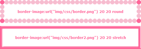 表示例:Chrome
border-image-outset
ボーダー画像のはみだし方法
2011/12/1
border-image-outsetプロパティは、ボーダー領域をを基準よりどれだけ外に広げるかをボーダーの幅の倍数で指定します。
- デフォルト値:0
- 適用:全要素(border-collapse:collapseが指定されているテーブル要素は除く)
- 継承はされません。
border-image-repeat
ボーダー画像の繰り返し・角丸・伸縮方法
2011/12/1
border-image-repeatプロパティには、ボーダーの背景画像の繰り返し方法を指定します。
- デフォルト値:stretch
- 適用:全要素(border-collapse:collapseが指定されているテーブル要素は除く)
- 継承:しない
値
| 値 | 説明 |
|---|---|
| stretch | 画像を領域いっぱいに拡大して表示する。 |
| repeat | 画像を縦横両方向に繰り返してタイル状に敷き詰めて表示する。 |
| round | 画像を繰り返してタイル状に敷き詰めて表示する。ただし、太いるが領域内に収まらない場合は、画像を縮小して、領域内にフィットするようにする。spaceと異なり、画像間に空白はあかない。 |
サポート
Chrome: ○/Safari: ○/Firefox: ○/Opera 11: ○/IE9: ×
設置サンプル
<style type="text/css">
#d_borderimagerepeat div {
	border-width:15px;
	width:400px;
	margin:10px; padding:15px 25px;
}
#d_borderimagerepeat div.d_stretch {
	border-image:url(/content/img/css/border.png) 20 20 stretch ;
	-webkit-border-image:url(/content/img/css/border.png) 20 20 stretch;
	-moz-border-image:url(/content/img/css/border.png) 20 20 stretch;
	-ms-border-image:url(/content/img/css/border.png) 20 20 stretch;
	-o-border-image:url(/content/img/css/border.png) 20 20 stretch;
}
#d_borderimagerepeat div.d_repeat {
	border-image:url(/content/img/css/border.png) 20 20 repeat ;
	-webkit-border-image:url(/content/img/css/border.png) 20 20 repeat;
	-moz-border-image:url(/content/img/css/border.png) 20 20 repeat;
	-ms-border-image:url(/content/img/css/border.png) 20 20 repeat;
	-o-border-image:url(/content/img/css/border.png) 20 20 repeat;
}
#d_borderimagerepeat div.d_round {
	border-image:url(/content/img/css/border.png) 20 20 round ;
	-webkit-border-image:url(/content/img/css/border.png) 20 20 round;
	-moz-border-image:url(/content/img/css/border.png) 20 20 round;
	-ms-border-image:url(/content/img/css/border.png) 20 20 round;
	-o-border-image:url(/content/img/css/border.png) 20 20 round;
}
</style>

<div id="d_borderimagerepeat">
	<div class="d_stretch">stretch</div>
	<div class="d_repeat">repeat</div>
	<div class="d_round">round</div>
</div>
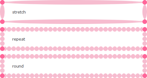 表示例:Chrome
border-image-slice
ボーダー画像の内側のオフセット
2011/12/1
border-image-sliceプロパティには、ボーダーの背景画像のスライス方法を指定します。
4つの値は、画像の上右下左それぞれの端からオフセットを表し、画像を9つの領域(4つの角、4つのエッジ、中間)に分けます。
- デフォルト値:100%
- 適用:全要素(border-collapse:collapseが指定されているテーブル要素は除く)
- 継承:しない
サポート
Chrome: ○/Safari: ○/Firefox: ○/Opera 11: ○/IE9: ×
設置サンプル
例
<style type="text/css">
#d_borderimagerslice1 {
	border-image-source:url(/content/img/css/border.png);
	border-image-slice:60;
	border-image-width:15px;
	border-image-outset:0;
	border-image-repeat:stretch;

	border-image:url(/content/img/css/border.png)  60 / 15px stretch;
	-webkit-border-image:url(/content/img/css/border.png) 60 / 15px stretch;
	-moz-border-image:url(/content/img/css/border.png) 60 / 15px stretch;
	-ms-border-image:url(/content/img/css/border.png) 60 / 15px stretch;
	-o-border-image:url(/content/img/css/border.png) 60 / 15px stretch;
	padding:10px;
}
</style>

<div id="d_borderimagerslice1">border-image-slice</div>
 表示例:Chrome
例:木枠風
素材:Chalkboard icon psd by Manuel López Muñiz - Designmoo
<style type="text/css">
#d_borderimagerslice2 div {
	border-image-source:url(/content/img/css/frame.png);
	border-image-slice:12;
	border-image-width:12px;
	border-image-outset:0;
	border-image-repeat:stretch;

	border-image:url(/content/img/css/frame.png) 12 / 12px stretch;
	-webkit-border-image:url(/content/img/css/frame.png) 12 / 12px stretch;
	-moz-border-image:url(/content/img/css/frame.png) 12 / 12px stretch;
	-ms-border-image:url(/content/img/css/frame.png) 12 / 12px stretch;
	-o-border-image:url(/content/img/css/frame.png) 12 / 12px stretch;
}
div .pic1 {
	float:left;
	width:320px;
}
div .pic2 {
	width:120px;
	float:right;
}
</style>

<div id="d_borderimagerslice2" class="cf">
	<div class="pic1"><img src="/content/img/pic1.png" alt="ドーナツ" /></div>
	<div class="pic2"><img src="/content/img/pic1-thumb.png" alt="ドーナツ" /></div>
</div>
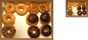 表示例:Chrome
border-image-source
ボーダーに使用する画像
2011/12/1
<image> = none | url('画像URL')
border-image-sourceプロパティは、ボーダーの背景画像を指定します。
- デフォルト値:none
- 適用:全要素(border-collapse:collapseが指定されているテーブル要素は除く)
- 継承:しない
border-image-width
ボーダー画像の幅
2011/12/1
border-image-widthプロパティには、、ボーダーの四隅の高さを指定します。
- デフォルト値:1
- 適用:全要素(border-collapse:collapseが指定されているテーブル要素は除く)
- 継承:しない
サポート
Chrome: ○/Safari: ○/Firefox: ○/Opera 11: ○/IE9: ×
設置サンプル
例:テープ
下記の画像をボーダー画像に指定し、テキストに角度を付けてテープ風に表示しています。

<style type="text/css">
#d_borderimagerwidth1 {
	border-image:url(/content/img/css/tape_yellow.png) 5 5 0 5 / 5px 5px 0 5px;
	-webkit-border-image:url(/content/img/css/tape_yellow.png) 5 5 0 5 / 5px 5px 0 5px;
	-moz-border-image:url(/content/img/css/tape_yellow.png) 5 5 0 5 / 5px 5px 0 5px;
	-ms-border-image:url(/content/img/css/tape_yellow.png) 5 5 0 5 / 5px 5px 0 5px;
	-o-border-image:url(/content/img/css/tape_yellow.png) 5 5 0 5 / 5px 5px 0 5px;
	margin:10px; padding:10px 0 20px 20px;
	width:15em;
	line-height:1;
}
#d_borderimagerwidth1 span {
	transform: rotate(-2deg);
	-webkit-transform: rotate(-2deg);
	-moz-transform: rotate(-2deg);
	-ms-transform: rotate(-2deg);
	-o-transform: rotate(-2deg);
	display:block;
}
</style>

<div id="d_borderimagerwidth1"><span>border-image-width</span></div>
 表示例:Chrome